Sketchnoting, also known as « visual notetaking » is a technique combining words with drawings, diagrams and typography to record ideas (Figure 1). This concept was invented by designer Michael Rohde in 2006 to combine tedious notetaking with doodling. He quickly discovered that adding drawings to his notes helped him concentrate and remember better. He would also be more likely to come back to his notes later on (something we must all admit is not so common). Similarly, after I followed a short online class by Magalie Le Gall (Sorbonne Université) I became convinced that sketchnoting shows promise and can have a positive impact on my scientific work.
Figure 1 : What is sketchnoting ? By verbaltovisual.com
Draw to remember more
The impact of sketchnoting on memory is not without scientific backing. Back in 1971, Allan Paivio, an American professor of psychology, developed the dual-coding theory. It posits that visual and verbal information are mentally processed in two distinctive systems and have additive effects on cognitive operations such as memory. Numerous experiments have empirically confirmed that dual coding (images + words) improve learning and memory. In addition, converting what you hear or see into visually interconnected drawings and words helps you synthesize content. Personalizing ideas into your own symbols and images also lays a strong basis for remembering. The implications of sketchnoting for educational purposes are therefore huge!
Draw to stay focused
I have only started sketchnoting recently but the impact this method had on my concentration immediately struck me. In the constant stream of information that we experience nowadays, I found that synthesizing ideas on paper using symbols and diagrams helped me stay focused on what I am presently reading or hearing, instead of letting my thoughts drift in a thousand different directions. Again, this outcome can have big implications in the classroom or at your desk. Using very basic lettering, bullets, frames and connectors (Figure 2), sketchnoting appears to be a good didactic tool.
Figure 2 : A few drawing tips by sketchnoter Carol Anne McGuire.
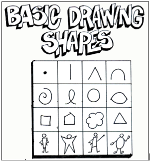
Draw to create and appeal
Figure 3 (source: ASIDE 2013)
Mike Rohde’s motto is « ideas, not art » because a lot of people have an immediate reaction of fear of failure when they are asked to draw something. He emphasizes that sketchnoting is not necessarily meant to be pretty, as it mostly serves a personal purpose. However, if you have an artistic fiber (even slightly!), sketchnoting becomes a great communication tool and can help you convey ideas in posters, slides, blogs, etc. Even very simple drawings are appealing and fun. You can create your own visual libraries from a few basic shapes (Figure 3). Anything can be drawn with a few simple lines! You can also use drawing libraries such as quickdraw.withgoogle.com to find examples and eventually gain confidence… as you realize that the average people’s drawing skills are pretty low (the dolphin drawings on this website are worth a look)!
Now, the key to developing this new skill is clearly to practice! From now on, I have decided to record every one of our monthly GEMM lab meetings in a sketchnote to make sure I keep track of our great discussions. I will also definitely try to apply this approach when reading scientific literature, attending conferences, preparing drafts, teaching and so much more! And for a start, what could be better then to sketchnote the research project I currently working on (Figure 4)?
Figure 4 : My first attempt at sketchnoting! Illustration of the OPAL project that I am working on (credit : S. Derville).
By Alexa Kownacki, Ph.D. Student, OSU Department of Fisheries and Wildlife, Geospatial Ecology of Marine Megafauna Lab
Data wrangling, in my own loose definition, is the necessary combination of both data selection and data collection. Wrangling your data requires accessing then assessing your data. Data collection is just what it sounds like: gathering all data points necessary for your project. Data selection is the process of cleaning and trimming data for final analyses; it is a whole new bag of worms that requires decision-making and critical thinking. During this process of data wrangling, I discovered there are two major avenues to obtain data: 1) you collect it, which frequently requires an exorbitant amount of time in the field, in the lab, and/or behind a computer, or 2) other people have already collected it, and through collaboration you put it to a good use (often a different use then its initial intent). The latter approach may result in the collection of so much data that you must decide which data should be included to answer your hypotheses. This process of data wrangling is the hurdle I am facing at this moment. I feel like I am a data detective.
Data wrangling illustrated by members of the R-programming community. (Image source: R-bloggers.com)
My project focuses on assessing the health conditions of the two ecotypes of bottlenose dolphins between the waters off of Ensenada, Baja California, Mexico to San Francisco, California, USA between 1981-2015. During the government shutdown, much of my data was inaccessible, seeing as it was in possession of my collaborators at federal agencies. However, now that the shutdown is over, my data is flowing in, and my questions are piling up. I can now begin to look at where these animals have been sighted over the past decades, which ecotypes have higher contaminant levels in their blubber, which animals have higher stress levels and if these are related to geospatial location, where animals are more susceptible to human disturbance, if sex plays a role in stress or contaminant load levels, which environmental variables influence stress levels and contaminant levels, and more!
Alexa, alongside collaborators, photographing transiting bottlenose dolphins along the coastline near Santa Barbara, CA in 2015 as part of the data collection process. (Image source: Nick Kellar).
Over the last two weeks, I was emailed three separate Excel spreadsheets representing three datasets, that contain partially overlapping data. If Microsoft Access is foreign to you, I would compare this dilemma to a very confusing exam question of “matching the word with the definition”, except with the words being in different languages from the definitions. If you have used Microsoft Access databases, you probably know the system of querying and matching data in different databases. Well, imagine trying to do this with Excel spreadsheets because the databases are not linked. Now you can see why I need to take a data management course and start using platforms other than Excel to manage my data.
A visual interpretation of trying to combine datasets being like matching the English definition to the Spanish translation. (Image source: Enchanted Learning)
In the first dataset, there are 6,136 sightings of Common bottlenose dolphins (Tursiops truncatus) documented in my study area. Some years have no sightings, some years have fewer than 100 sightings, and other years have over 500 sightings. In another dataset, there are 398 bottlenose dolphin biopsy samples collected between the years of 1992-2016 in a genetics database that can provide the sex of the animal. The final dataset contains records of 774 bottlenose dolphin biopsy samples collected between 1993-2018 that could be tested for hormone and/or contaminant levels. Some of these samples have identification numbers that can be matched to the other dataset. Within these cross-reference matches there are conflicting data in terms of amount of tissue remaining for analyses. Sorting these conflicts out will involve more digging from my end and additional communication with collaborators: data wrangling at its best. Circling back to what I mentioned in the beginning of this post, this data was collected by other people over decades and the collection methods were not standardized for my project. I benefit from years of data collection by other scientists and I am grateful for all of their hard work. However, now my hard work begins.
The cutest part of data wrangling: finding adorable images of bottlenose dolphins, photographed during a coastal survey. (Image source: Alexa Kownacki).
There is also a large amount of data that I downloaded from federally-maintained websites. For example, dolphin sighting data from research cruises are available for public access from the OBIS (Ocean Biogeographic Information System) Sea Map website. It boasts 5,927,551 records from 1,096 data sets containing information on 711 species with the help of 410 collaborators. This website is incredible as it allows you to search through different data criteria and then download the data in a variety of formats and contains an interactive map of the data. You can explore this at your leisure, but I want to point out the sheer amount of data. In my case, the OBIS Sea Map website is only one major platform that contains many sources of data that has already been collected, not specifically for me or my project, but will be utilized. As a follow-up to using data collected by other scientists, it is critical to give credit where credit is due. One of the benefits of using this website, is there is information about how to properly credit the collaborators when downloading data. See below for an example:
Example citation for a dataset (Dataset ID: 1201):
Lockhart, G.G., DiGiovanni Jr., R.A., DePerte, A.M. 2014. Virginia and Maryland Sea Turtle Research and Conservation Initiative Aerial Survey Sightings, May 2011 through July 2013. Downloaded from OBIS-SEAMAP (http://seamap.env.duke.edu/dataset/1201) on xxxx-xx-xx.
Another federally-maintained data source that boasts more data than I can quantify is the well-known ERDDAP website. After a few Google searches, I finally discovered that the acronym stands for Environmental Research Division’s Data Access Program. Essentially, this the holy grail of environmental data for marine scientists. I have downloaded so much data from this website that Excel cannot open the csv files. Here is yet another reason why young scientists, like myself, need to transition out of using Excel and into data management systems that are developed to handle large-scale datasets. Everything from daily sea surface temperatures collected on every, one-degree of latitude and longitude line from 1981-2015 over my entire study site to Ekman transport levels taken every six hours on every longitudinal degree line over my study area. I will add some environmental variables in species distribution models to see which account for the largest amount of variability in my data. The next step in data selection begins with statistics. It is important to find if there are highly correlated environmental factors prior to modeling data. Learn more about fitting cetacean data to models here.
The ERDAPP website combined all of the average Sea Surface Temperatures collected daily from 1981-2018 over my study site into a graphical display of monthly composites. (Image Source: ERDDAP)
As you can imagine, this amount of data from many sources and collaborators is equal parts daunting and exhilarating. Before I even begin the process of determining the spatial and temporal spread of dolphin sightings data, I have to identify which data points have sex identified from either hormone levels or genetics, which data points have contaminants levels already quantified, which samples still have tissue available for additional testing, and so on. Once I have cleaned up the datasets, I will import the data into the R programming package. Then I can visualize my data in plots, charts, and graphs; this will help me identify outliers and potential challenges with my data, and, hopefully, start to see answers to my focal questions. Only then, can I dive into the deep and exciting waters of species distribution modeling and more advanced statistical analyses. This is data wrangling and I am the data detective.
What people may think a ‘data detective’ looks like, when, in reality, it is a person sitting at a computer. (Image source: Elder Research)
Like the well-known phrase, “With great power comes great responsibility”, I believe that with great data, comes great responsibility, because data is power. It is up to me as the scientist to decide which data is most powerful at answering my questions.
Data is information. Information is knowledge. Knowledge is power. (Image source: thedatachick.com)