What is that whale doing? Only residence in space and time will tell…

By Lisa Hildebrand, MSc student, OSU Department of Fisheries and Wildlife, Geospatial Ecology of Marine Megafauna Lab

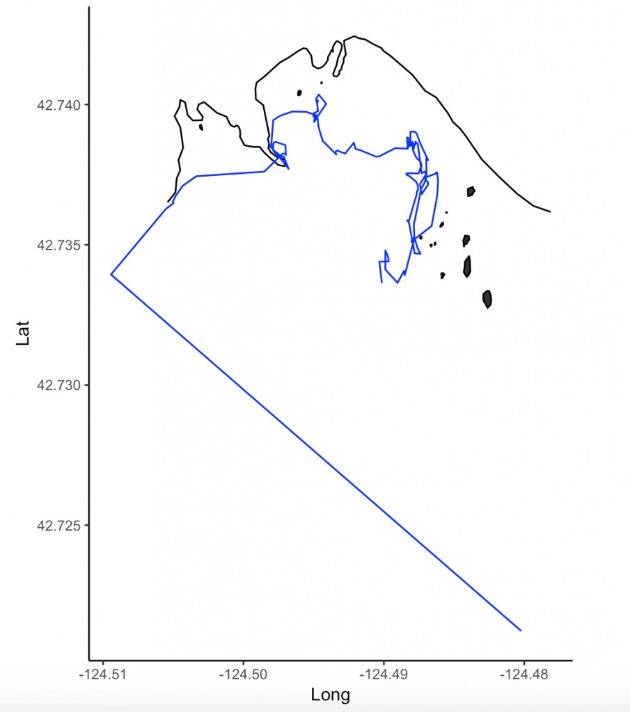
For my research in Port Orford, my field team and I track individual gray whales continuously from a shore-based location: once we spot a whale we will track it for the entire time that it remains in our study site. The time spent tracking a whale can vary widely. In the 2018 field season, our shortest trackline was three minutes, and our longest track was over three hours in duration.

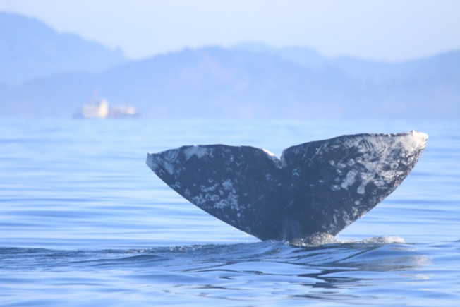
This variability in foraging time is partly what sparked my curiosity to investigate potential foraging differences between individuals of the Pacific Coast Feeding Group (PCFG) gray whales. I want to know why some individuals, like “Humpy” who was our longest tracked individual in 2018, stayed in an area for so long, while others, like “Smokey”, only stayed for three minutes (Figure 1). It is hard to pinpoint just one variable that drives these decisions (e.g., prey, habitat) made by individuals about where they forage and how long because the marine environment is so dynamic. Foraging decisions are likely dictated by several factors acting in concert with one another. As a result, I have many research questions, including (but certainly not limited to):

  1. Does prey density drive length of individual foraging bouts?
  2. Do individual whales have preferences for a particular prey species?
  3. Are prey patches containing gravid zooplankton targeted more by whales?
  4. Do whales prefer to feed closer to kelp patches?
  5. How does water depth factor into all of the above decisions and/or preferences? 

I hope to get to the bottom of these questions through the data analyses I will be undertaking for my second chapter of my Master’s thesis. However, before I can answer those questions, I need to do a little bit of tidying up of my whale tracklines. Now that the 2019 field season is over and I have all of the years of data that I will be analyzing for my thesis (2015-2019), I have spent the past 1-2 weeks diving into the trackline clean-up and analysis preparation.

The first step in this process is to run a speed filter over each trackline. The aim of the speed filter is to remove any erroneous points or outliers that must be wrong based on the known travel speeds of gray whales. Barb Lagerquist, a Marine Mammal Institute (MMI) colleague who has tracked gray whales for several field seasons, found that the fastest individual she ever encountered traveled at a speed of 17.3 km/h (personal communication). Therefore, based on this information,  my tracklines are run through a speed filter set to remove any points that suggest that the whale traveled at 17.3 km/h or faster (Figure 2). 

Fig 3. Trackline of “Humpy” after interpolation. The red points are interpolated.

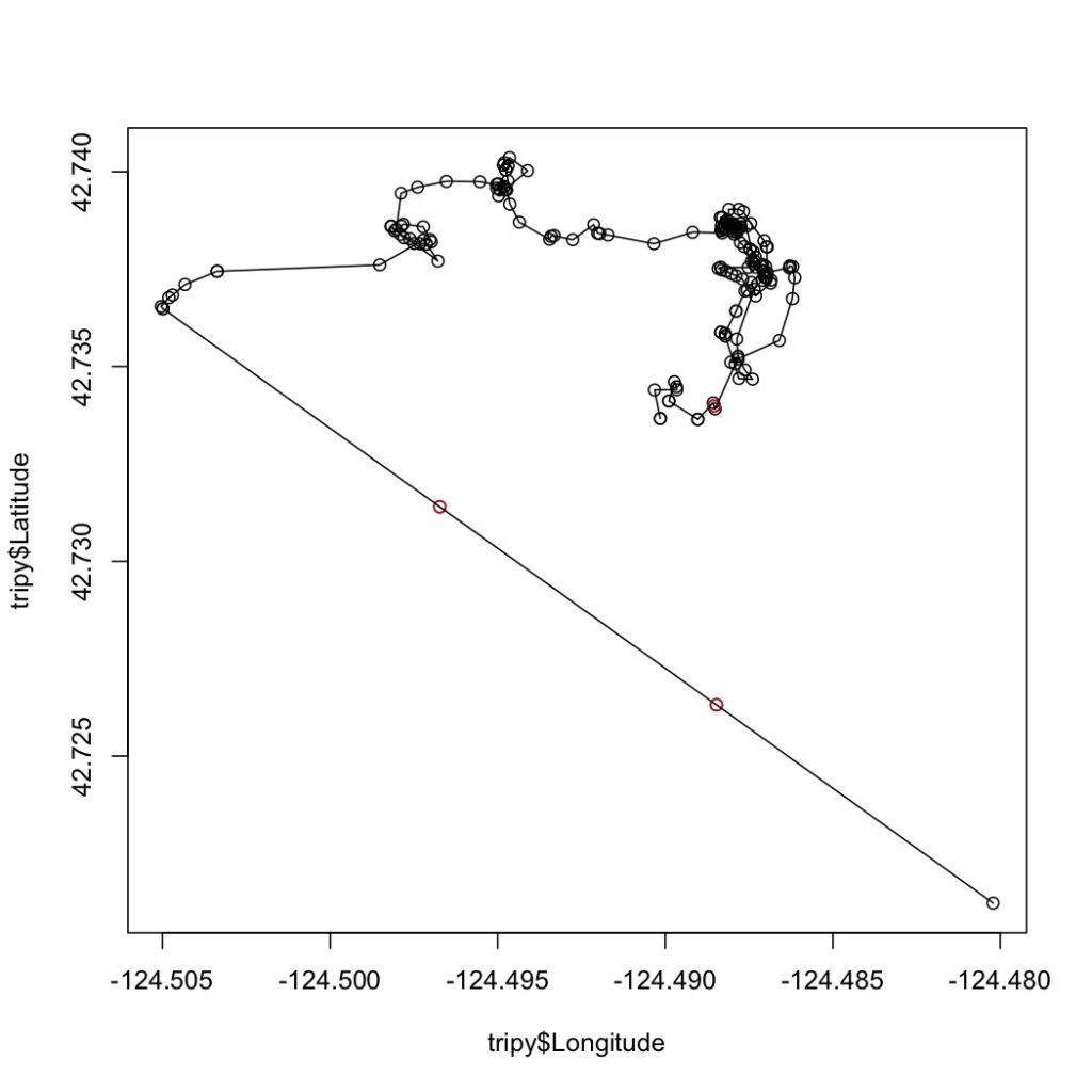
Next, the speed-filtered tracklines are interpolated (Figure 3). Interpolation fills spatial and/or temporal gaps in a data set by evenly spacing points (by distance or time interval) between adjacent points. These gaps sometimes occur in my tracklines when the tracking teams misses one or several surfacings of a whale or because the whale is obscured by a large rock. 

After speed filtration and interpolation has occurred, the tracklines are ready to be analyzed using Residence in Space and Time (RST; Torres et al. 2017) to assign behavior state to each location. The questions I am hoping to answer for my thesis are based upon knowing the behavioral state of a whale at a given location and time. In order for me to draw conclusions over whether or not a whale prefers to forage by a reef with kelp rather than a reef without kelp, or whether it prefers Holmesimysis sculpta over Neomysis rayii, I need to know when a whale is actually foraging and when it is not. When we track whales from our cliff site, we assign a behavior to each marked location of an individual. It may sound simple to pick the behavior a whale is currently exhibiting, however it is much harder than it seems. Sometimes the behavioral state of a whale only becomes apparent after tracking it for several minutes. Yet, it’s difficult to change behaviors retroactively while tracking a whale and the qualitative assignment of behavior states is not an objective method. Here is where RST comes in.

Those of you who have been following the blog for a few years may recall a post written in early 2017 by Rachael Orben, a former post-doc in the GEMM Lab who currently leads the Seabird Oceanography Lab. The post discussed the paper “Classification of Animal Movement Behavior through Residence in Space Time” written by Leigh and Rachael with two other collaborators, which had just been published a few days prior. If you want to know the nitty gritty of what RST is and how it works, I suggest reading Rachael’s blog, the GEMM lab’s brief description of the project and/or the actual paper since it is an open-access publication. However, in a nut shell, RST allows a user to identify three primary behavioral states in a tracking dataset based on the time and distance the individual spent within a given radius. The three behavioral categories are as follows:

Fig 4. Visualization of the three RST behavioral categories. Taken from Torres et al. (2017).
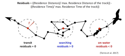
  • Transit – characterized by short time and distance spent within an area (radius of given size), meaning the individual is traveling.
  • Time-intensive – characterized by a long time spent within an area, meaning the individual is spending relatively more time but not moving much distance (such as resting in one spot). 
  • Time & distance-intensive – characterized by relatively high time and distances spent within an area, meaning the individual is staying within and moving around a lot in an area, such as searching or foraging. 

What behavior these three categories represent depends on the resolution of the data analyzed. Is one point every day for two years? Then the data are unlikely to represent resting. Or is the data 1 point every second for 1 hour? In which case travel segments may cover short distances. On average, my gray whale tracklines are composed of a point every 4-5 minutes for 1-2 hours.  Bases on this scale of tracking data, I will interpret the categories as follows: Transit is still travel, time & distance-intensive points represent locations where the whale was searching because it was moving around one area for a while, and time-intensive points represent foraging behavior because the whale has ‘found what it is looking for’ and is spending lots of time there but not moving around much anymore. The great thing about RST is that it removes the bias that is introduced by my field team when assigning behavioral states to individual whales (Figure 5). RST looks at the tracklines in a very objective way and determines the behavioral categories quantitatively, which helps to remove the human subjectivity.

While it took quite a bit of troubleshooting in R and overcoming error messages to make the codes run on my data, I am proud to have results that are interesting and meaningful with which I can now start to answer some of my many research questions. My next steps are to create interpolated prey density and distance to kelp layers in ArcGIS. I will then be able to overlay my cleaned up tracklines to start teasing out potential patterns and relationships between individual whale foraging movements and their environment. 

Literature cited

Torres, L. G., R. A. Orben, I. Tolkova, and D. R. Thompson. 2017. Classification of animal movement behavior through residence in space and time. PLoS ONE: doi. org/10.1371/journal.pone.0168513.

Demystifying the algorithm

By Clara Bird, Masters Student, OSU Department of Fisheries and Wildlife, Geospatial Ecology of Marine Megafauna Lab

Hi everyone! My name is Clara Bird and I am the newest graduate student in the GEMM lab. For my master’s thesis I will be using drone footage of gray whales to study their foraging ecology. I promise to talk about how cool gray whales in a following blog post, but for my first effort I am choosing to write about something that I have wanted to explain for a while: algorithms. As part of previous research projects, I developed a few semi-automated image analysis algorithms and I have always struggled with that jargon-filled phrase. I remember being intimidated by the term algorithm and thinking that I would never be able to develop one. So, for my first blog I thought that I would break down what goes into image analysis algorithms and demystify a term that is often thrown around but not well explained.

What is an algorithm?

The dictionary broadly defines an algorithm as “a step-by-step procedure for solving a problem or accomplishing some end” (Merriam-Webster). Imagine an algorithm as a flow chart (Fig. 1), where each step is some process that is applied to the input(s) to get the desired output. In image analysis the output is usually isolated sections of the image that represent a specific feature; for example, isolating and counting the number of penguins in an image. Algorithm development involves figuring out which processes to use in order to consistently get desired results. I have conducted image analysis previously and these processes typically involve figuring out how to find a certain cutoff value. But, before I go too far down that road, let’s break down an image and the characteristics that are important for image analysis.

Figure 1. An example of a basic algorithm flow chart. There are two inputs: variables A and B. The process is the calculation of the mean of the two variables.

What is an image?

Think of an image as a spread sheet, where each cell is a pixel and each pixel is assigned a value (Fig. 2). Each value is associated with a color and when the sheet is zoomed out and viewed as a whole, the image comes together.  In color imagery, which is also referred to as RGB, each pixel is associated with the values of the three color bands (red, green, and blue) that make up that color. In a thermal image, each pixel’s value is a temperature value. Thinking about an image as a grid of values is helpful to understand the challenge of translating the larger patterns we see into something the computer can interpret. In image analysis this process can involve using the values of the pixels themselves or the relationships between the values of neighboring pixels.

Figure 2. A diagram illustrating how pixels make up an image. Each pixel is a grid cell associated with certain values. Image Source: https://web.stanford.edu/class/cs101/image-1-introduction.html

Our brains take in the whole picture at once and we are good at identifying the objects and patterns in an image. Take Figure 3 for example: an astute human eye and brain can isolate and identify all the different markings and scars on the fluke. Yet, this process would be very time consuming. The trick to building an algorithm to conduct this work is figuring out what processes or tools are needed to get a computer to recognize what is marking and what is not. This iterative process is the algorithm development.

Figure 3. Photo ID image of a gray whale fluke.

Development

An image analysis algorithm will typically involve some sort of thresholding. Thresholds are used to classify an image into groups of pixels that represent different characteristics. A threshold could be applied to the image in Figure 3 to separate the white color of the markings on the fluke from the darker colors in the rest of the image. However, this is an oversimplification, because while it would be pretty simple to examine the pixel values of this image and pick a threshold by hand, this threshold would not be applicable to other images. If a whale in another image is a lighter color or the image is brighter, the pixel values would be different enough from those in the previous image for the threshold to inaccurately classify the image. This problem is why a lot of image analysis algorithm development involves creating parameterized processes that can calculate the appropriate threshold for each image.

One successful method used to determine thresholds in images is to first calculate the frequency of color in each image, and then apply the appropriate threshold. Fletcher et al. (2009) developed a semiautomated algorithm to detect scars in seagrass beds from aerial imagery by applying an equation to a histogram of the values in each image to calculate the threshold. A histogram is a plot of the frequency of values binned into groups (Fig. 4). Essentially, it shows how many times each value appears in an image. This information can be used to define breaks between groups of values. If the image of the fluke were transformed to a gray scale, then the values of the marking pixels would be grouped around the value for white and the other pixels would group closer to black, similar to what is shown in Figure 4. An equation can be written that takes this frequency information and calculates where the break is between the groups. Since this method calculates an individualized threshold for each image, it’s a more reliable method for image analysis. Other characteristics could also be used to further filter the image, such as shape or area.

However, that approach is not the only way to make an algorithm applicable to different images; semi-automation can also be helpful. Semi-automation involves some kind of user input. After uploading the image for analysis, the user could also provide the threshold, or the user could crop the image so that only the important components were maintained. Keeping with the fluke example, the user could crop the image so that it was only of the fluke. This would help reduce the variety of colors in the image and make it easier to distinguish between dark whale and light marking.

Figure 4. Example histogram of pixel values. Source: Moallem et al. 2012

Why algorithms are important

Algorithms are helpful because they make our lives easier. While it would be possible for an analyst to identify and digitize each individual marking from a picture of a gray whale, it would be extremely time consuming and tedious. Image analysis algorithms significantly reduce the time it takes to process imagery. A semi-automated algorithm that I developed to count penguins from still drone imagery can count all the penguins on a one km2 island in about 30 minutes, while it took me 24 long hours to count them by hand (Bird et al. in prep). Furthermore, the process can be repeated with different imagery and analysts as part of a time series without bias because the algorithm eliminates human error introduced by different analysts.

Whether it’s a simple combination of a few processes or a complex series of equations, creating an algorithm requires breaking down a task to its most basic components. Development involves translating those components step by step into an automated process, which after many trials and errors, achieves the desired result. My first algorithm project took two years of revising, improving, and countless trials and errors.  So, whether creating an algorithm or working to understand one, don’t let the jargon nor the endless trials and errors stop you. Like most things in life, the key is to have patience and take it one step at a time.

References

Bird, C. N., Johnston, D.W., Dale, J. (in prep). Automated counting of Adelie penguins (Pygoscelis adeliae) on Avian and Torgersen Island off the Western Antarctic Peninsula using Thermal and Multispectral Imagery. Manuscript in preparation

Fletcher, R. S., Pulich, W. ‡, & Hardegree, B. (2009). A Semiautomated Approach for Monitoring Landscape Changes in Texas Seagrass Beds from Aerial Photography. https://doi.org/10.2112/07-0882.1

Moallem, Payman & Razmjooy, Navid. (2012). Optimal Threshold Computing in Automatic Image Thresholding using Adaptive Particle Swarm Optimization. Journal of Applied Research and Technology. 703.

Surveying for marine mammals in the Northern California Current

By Dawn Barlow, PhD student, OSU Department of Fisheries and Wildlife, Geospatial Ecology of Marine Megafauna Lab

There is something wonderful about time at sea, where your primary obligation is to observe the ocean from sunrise to sunset, day after day, scanning for signs of life. After hours of seemingly empty blue with only an occasional albatross gliding over the swells on broad wings, it is easy to question whether there is life in the expansive, blue, offshore desert. Splashes on the horizon catch your eye, and a group of dolphins rapidly approaches the ship in a flurry of activity. They play in the ship’s bow and wake, leaping out of the swells. Then, just as quickly as they came, they move on. Back to blue, for hours on end… until the next stirring on the horizon. A puff of exhaled air from a whale that first might seem like a whitecap or a smudge of sunscreen or salt spray on your sunglasses. It catches your eye again, and this time you see the dark body and distinctive dorsal fin of a humpback whale.

I have just returned from 10 days aboard the NOAA ship Bell M. Shimada, where I was the marine mammal observer on the Northern California Current (NCC) Cruise. These research cruises have sampled the NCC in the winter, spring, and fall for decades. As a result, a wealth of knowledge on the oceanography and plankton community in this dynamic ocean ecosystem has been assimilated by a dedicated team of scientists (find out more via the Newportal Blog). Members of the GEMM Lab have joined this research effort in the past two years, conducting marine mammal surveys during the transits between sampling stations (Fig. 2).

Figure 2. Northern California Current cruise sampling locations, where oceanography and plankton data are collected. Marine mammal surveys were conducted on the transits between stations.

The fall 2019 NCC cruise was a resounding success. We were able to survey a large swath of the ecosystem between Crescent City, CA and La Push, WA, from inshore to 200 miles offshore. During that time, I observed nine different species of marine mammals (Table 1). As often as I use some version of the phrase “the marine environment is patchy and dynamic”, it never fails to sink in a little bit more every time I go to sea. On the map in Fig. 3, note how clustered the marine mammal sightings are. After nearly a full day of observing nothing but blue water, I would find myself scrambling to keep up with recording all the whales and dolphins we were suddenly in the midst of. What drives these clusters of sightings? What is it about the oceanography and prey community that makes any particular area a hotspot for marine mammals? We hope to get at these questions by utilizing the oceanographic data collected throughout the surveys to better understand environmental drivers of these distribution patterns.

 Table 1. Summary of marine mammal sightings from the September 2019 NCC Cruise.

Species # sightings Total # individuals
Northern Elephant Seal 1 1
Northern Fur Seal 2 2
Common Dolphin 2 8
Pacific White-sided Dolphin 8 143
Dall’s Porpoise 4 19
Harbor Porpoise 1 3
Sperm Whale 1 1
Fin Whale 1 1
Humpback Whale 22 36
Unidentified Baleen Whale 14 16
Figure 3. Map of marine mammal sighting locations from the September NCC cruise.

It was an auspicious time to survey the Northern California Current. Perhaps you have read recent news reports warning about the formation of another impending marine heatwave, much like the “warm blob” that plagued the North Pacific in 2015. We experienced it first-hand during the NCC cruise, with very warm surface waters off Newport extending out to 200 miles offshore (Fig. 4). A lot of energy input from strong winds would be required to mix that thick, warm layer and allow cool, nutrient-rich water to upwell along the coast. But it is already late September, and as the season shifts from summer to fall we are at the end of our typical upwelling season, and the north winds that would typically drive that mixing are less likely. Time will tell what is in store for the NCC ecosystem as we face the onset of another marine heatwave.

Figure 4. Temperature contours over the upper 150 m from 1-200 miles off Newport, Oregon from Fall 2014-2019. During Fall 2014, the Warm Blob inundated the Oregon shelf. Surface temperatures during that survey were 17°- 18°C along the entire transect. During 2015 and 2016 the warm water (16°C) layer had deepened and occupied the upper 50 m. During 2018, the temperature was 16°C in the upper 20 m and cooler on the shelf, indicative of residual upwelling. During this survey in 2019, we again saw very warm (18°C) temperatures in the upper water column over the entire transect. Image and caption credit: Jennifer Fisher.

It was a joy to spend 10 days at sea with this team of scientists. Insight, collaboration, and innovation are born from interdisciplinary efforts like the NCC cruises. Beyond science, what a privilege it is to be on the ocean with a group of people you can work with and laugh with, from the dock to 200 miles offshore, south to north and back again.

Dawn Barlow on the flying bridge of NOAA Ship Bell M. Shimada, heading out to sea with the Newport bridge in the background. Photo: Anna Bolm.

The significance of blubber hormone sampling in conservation and monitoring of marine mammals

By: Alexa Kownacki, Ph.D. Student, OSU Department of Fisheries and Wildlife, Geospatial Ecology of Marine Megafauna Lab

Marine mammals are challenging to study for many reasons, and specifically because they inhabit the areas of the Earth that are uninhabited by people: the oceans. Monitoring marine mammal populations to gather baselines on their health condition and reproductive status is not as simple as trap and release, which is a method often conducted for terrestrial animals. Marine mammals are constantly moving in vast areas below the surface. Moreover, cetaceans, which do not spend time on land, are arguably the most challenging to sample.

One component of my project, based in California, USA, is a health assessment analyzing hormones of the bottlenose dolphins that frequent both the coastal and the offshore waters. Therefore, I am all too familiar with the hurdles of collecting health data from living marine mammals, especially cetaceans. However, the past few decades have seen major advancements in technology both in the laboratory and with equipment, including one tool that continues to be critical in understanding cetacean health: blubber biopsies.

Biopsy dart hitting a bottlenose dolphin below the dorsal fin. Image Source: NMFS

Blubber biopsies are typically obtained via low-powered crossbow with a bumper affixed to the arrow to de-power it once it hits the skin. The arrow tip has a small, pronged metal attachment to collect an eraser-tipped size amount of tissue with surface blubber and skin. I compare this to a skin punch biopsies in humans; it’s small, minimally-invasive, and requires no follow-up care. With a small team of scientists, we use small, rigid-inflatable vessels to survey the known locations of where the bottlenose dolphins tend to gather. Then, we assess the conditions of the seas and of the animals, first making sure we are collecting from animals without potentially lowered immune systems (no large, visible wounds) or calves (less than one years old). Once we have photographed the individual’s dorsal fin to identify the individual, one person assembles the biopsy dart and crossbow apparatus following sterile procedures when attaching the biopsy tips to avoid infection. Another person prepares to photograph the animal to match the biopsy information to the individual dolphin. One scientist aims the crossbow for the body of the dolphin, directly below the dorsal fin, while the another photographs the biopsy dart hitting the animal and watches where it bounces off. Then, the boat maneuvers to the floating biopsy dart to recover the dart and the sample. Finally, the tip with blubber and skin tissue is collected, again using sterile procedures, and the sample is archived for further processing. A similar process, using an air gun instead of a crossbow can be viewed below:

GEMM Lab members using an air gun loaded with a biopsy dart to procure marine mammal blubber from a blue whale in New Zealand. Video Source: GEMM Laboratory.

Part of the biopsy process is holding ourselves to the highest standards in our minimally-invasive technique, which requires constant practice, even on land.

Alexa practicing proper crossbow technique on land under supervision. Image Source: Alexa Kownacki

Blubber is the lipid-rich, vascularized tissue under the epidermis that is used in thermoregulation and fat storage for marine mammals. Blubber is an ideal matrix for storing lipophilic (fat-loving) steroid hormones because of its high fat content. Steroid hormones, such as cortisol, progesterone, and testosterone, are naturally circulating in the blood stream and are released in high concentrations during specific events. Unlike blood, blubber is less dynamic and therefore tells a much longer history of the animal’s nutritional state, environmental exposure, stress level, and life history status. Blubber is the cribs-notes version of a marine mammal’s biography over its previous few months of life. Blood, on the other hand, is the news story from the last 24 hours. Both matrices serve a specific purpose in telling the story, but blubber is much more feasible to obtain from a cetacean and provides a longer time frame in terms of information on the past.

A simplified depiction of marine mammal blubber starting from the top (most exterior surface) being the skin surface down to the muscle (most interior). Image Source: schoolnet.org.za

I use blubber biopsies for assessing cortisol, testosterone, and progesterone in the bottlenose dolphins. Cortisol is a glucocorticoid that is frequently associated with stress, including in humans. Marine mammals utilize the same hypothalamic-pituitary-adrenal (HPA) axis that is responsible for the fight-or-flight response, as well as other metabolic regulations. During prolonged stressful events, cortisol levels will remain elevated, which has long-term repercussions for an animal’s health, such as lowered immune systems and decreased ability to respond to predators. Testosterone and progesterone are sex hormones, which can be used to indicate sex of the individual and determine reproductive status. This reproductive information allows us to assess the population’s composition and structure of males and females, as well as potential growth or decline in population (West et al. 2014).

Alexa using a crossbow from a small boat off of San Diego, CA. Image Source: Alexa Kownacki

The coastal and offshore bottlenose dolphin ecotypes of interest in my research occupy different locations and are therefore exposed to different health threats. This is a primary reason for conducting health assessments, specifically analyzing blubber hormone levels. The offshore ecotype is found many kilometers offshore and is most often encountered around the southern Channel Islands. In contrast, the coastal ecotype is found within 2 kilometers of shore (Lowther-Thieleking et al. 2015) where they are subjected to more human exposure, both directly and indirectly, because of their close proximity to the mainland of the United States. Coastal dolphins have a higher likelihood of fishery-related mortality, the negative effects of urbanization including coastal runoff and habitat degradation, and recreational activities (Hwang et al. 2014). The blubber hormone data from my project will inform which demographics are most at-risk. From this information, I can provide data supporting why specific resources should be allocated differently and therefore help vulnerable populations. Further proving that the small amount of tissue from a blubber biopsy can help secure a better future for population by adjusting and informing conservation strategies.

Literature Cited:

Hwang, Alice, Richard H Defran, Maddalena Bearzi, Daniela. Maldini, Charles A Saylan, Aime ́e R Lang, Kimberly J Dudzik, Oscar R Guzo n-Zatarain, Dennis L Kelly, and David W Weller. 2014. “Coastal Range and Movements of Common Bottlenose Dolphins (Tursiops Truncatus) off California and Baja California, Mexico.” Bulletin of the Southern California Academy of Sciences 113 (1): 1–13. https://doi.org/10.3390/toxins6010211.

Lowther-Thieleking, Janet L., Frederick I. Archer, Aimee R. Lang, and David W. Weller. 2015. “Genetic Differentiation among Coastal and Offshore Common Bottlenose Dolphins, Tursiops Truncatus, in the Eastern North Pacific Ocean.” Marine Mammal Science 31 (1): 1–20. https://doi.org/10.1111/mms.12135.

West, Kristi L., Jan Ramer, Janine L. Brown, Jay Sweeney, Erin M. Hanahoe, Tom Reidarson, Jeffry Proudfoot, and Don R. Bergfelt. 2014. “Thyroid Hormone Concentrations in Relation to Age, Sex, Pregnancy, and Perinatal Loss in Bottlenose Dolphins (Tursiops Truncatus).” General and Comparative Endocrinology 197: 73–81. https://doi.org/10.1016/j.ygcen.2013.11.021.

What does it mean to be an effective science communicator?

By Dominique Kone, Masters Student in Marine Resource Management

To succeed as a scientist, you not only need to be well-trained in the scientific method, but also be familiar with the standards and practices in your discipline. While many scientists are skilled in the production of scientific information, fewer are as well-prepared to disseminate and communicate that information to diverse audiences. As a graduate student, learning effective science communication is one of my top priorities because I believe scientific information can and should be accessible to everyone. As I’ve been building and expanding upon my own communication toolbox, I constantly ask myself, what is effective science communication?

Simply put, communication can be thought of as the two-way transfer of information and knowledge. On one side, information is broadcasted and amplified out into the world, and on the other side, that information is received and understood, ideally. If communicating were this easy, people would never have to worry about being misinterpreted. Yet, this ideal is far from reality, and information is oftentimes misconstrued and/or ignored. This scenario is quite common when scientists communicate technical concepts or findings to non-scientists, either due to differences in communication styles or terminology use. In connecting with these types of audiences, I think effective science communication is a function of three key qualities: intentionality, creativity, and knowledge.

Source: ISTOCKPHOTO/THINKSTOCK

Intentionality

When scientists communicate information, being intentional with what they say and when they say it, can greatly influence how messages resonate with their audience. There’s often a big disconnect between the very specific scientific terms scientists use and the terms their non-technical audiences use. One way scientists can bridge this disconnect and be more intentional (thoughtful), is with word-choice. When scientists change their words, this doesn’t mean they “dumb down” their presentations; rather, they substitute words to better explain concepts in terms the audience easily understands. For example, if I tell the public “I’m predicting sea otter populations at carrying capacity in Oregon using a Bayesian habitat model”, this sentence has three jargon words (carrying capacity, Bayesian, model) that likely mean nothing to this audience. Instead, what I say is, “I’m predicting how many sea otters could live in Oregon based on available habitat”. Now I’m speaking in terms that resonate with my audience, and I have effectively made the same point. An intentional science communicator knows how to deliver information to meet their audience’s ability to take in and process that information.

Source: Andrew Grossman

Creativity

Scientists typically follow structured and defensible protocols when conducting analyses. Far fewer standards apply to how they communicate that research, which can free them up to be more creative in their delivery. One way scientists can be both intentional and creative is by using analogies, examples, or metaphors. When I give talks, I always talk about the high metabolism of sea otters (30% of their own body weight in food, daily) (Costa 1978, Riedman & Estes 1990). Most researchers seem intrigued by this fact, but anyone younger than the age of 10, honestly, could care less. To catch their attention, I always follow up this fact by estimating how many pizza slices I would need to eat to reach that daily food requirement, based on my own weight (230 pizza slices, if you’re curious). By using this analogy, my young audience not only understands my point, but they’re now way more interested because they can’t fathom a human eating that much pizza. It’s a simple comparison, but effective.

Creativity can also be applied to the different ways scientific information is delivered. Scientists regularly publish their work in peer-review scientific journals to reach other scientists. But they also produce short reports and fact sheets to briefly summarize studies for managers or policy-makers. They hold events or workshops to engage stakeholders. They use blogs, webpages, and YouTube to reach the broader public. They even use Twitter to share papers! Scientists do so much more than just publishing their work, and they have several options for delivering and communicating their research. All these different options create more opportunities for scientists to experiment and find new and exciting ways to deliver their science.

A stoic scientist communicating to the masses. Source: Dave Allen via NIWA.

Knowledge

It’s important for scientists to be knowledgeable about their subjects when communicating, but they can’t know everything. Rather, I think a more reasonable goal is for scientists to be comfortable and prepared to say what they know and what they don’t know. Scientists have a thirst for knowledge, but some communicate false information because they have a drive to answer every question they’re asked. They can sometimes get into trouble when they’re asked to talk about something they’re less familiar with. When asked a difficult question, I’ve witnessed a lot of scientists say, “I don’t know”, or, “I don’t know, but I could speculate [insert answer] based on other information”.  This response allows them to answer the question, while also being truthful. The alternative could have real negative implications (e.g. a certain President spreading false information about a dangerous hurricane).

Aside from factual knowledge, contextual knowledge is underappreciated in science communication, but can be vitally important. Some management issues are politically contentious, and effective science communicators can play vital roles in those management processes or actions. One study found that by scientists engaging with stakeholders in the planning process for renewable energy development along the coast of Maine, community members felt the development planning process was being conducted in the most effective manner (Johnson et al. 2015). In this example, a seemingly contentious situation was defused because scientists understood the political and social landscape, and were able to carefully communicate with stakeholders before any management actions took place. Scientists are not required to engage with stakeholders to this degree, but being sensitive to the broader (political, social, cultural, economic) environment in which those stakeholders live and operate can help them better target your messages and relieve potential tension.

GEMM Lab booth at Hatfield Marine Science Day! Source: Leila Lemos.

These three qualities (intentionality, creativity, and knowledge) are not meant to serve as hard, fast science communication rules. Instead, these are simply some qualities I’ve observed in other scientists skilled in effective communication. Scientists don’t automatically enter this space as expert communicators. For those that are great at it, it probably took some time and practice to hone their skills and find their own voice. It might come more naturally to some scientists, but I would argue most – like myself – have to work really hard to develop those skills. As I progress through my career, I’m excited to develop my own skills in effective science communication, and perhaps discover new and exciting approaches along the way.

References:

Costa, D. P. 1978. The ecological energetics, water, and electrolyte balance of the California sea otter (Enhydra lutris). Ph.D. dissertation, University of California, Santa Cruz.

Reidman, M. L. and J. A. Estes. 1990. The sea otter (Enhydra lutris): behavior, ecology, and natural history. United States Department of the Interior, Fish and Wildlife Service, Biological Report. 90: 1-126.

Johnson, T. R., Jansujwiez, J. S., and G. Zydlewski. 2015. Tidal power development n Maine: stakeholder identification and perceptions of engagement. Estuaries and Coasts 38: S266-S278.

The Seascape of Fear: What are the ecological implications of being afraid in the marine environment?

By Dawn Barlow, PhD student, OSU Department of Fisheries and Wildlife, Geospatial Ecology of Marine Megafauna Lab

In the GEMM Lab, our research focuses largely on the ecology of marine top predators. Inherent in our work are often assumptions that our study species—wide-ranging predators including whales, dolphins, otters, or seabirds—will distribute themselves relative to their prey. In order to make a living in the highly patchy and dynamic marine environment, predators must find ways to predictably locate and exploit prey resources.

But what about the prey? How do the prey structure themselves relative to their predators? This question is explored in depth in a paper titled “The Landscape of Fear: Ecological Implications of Being Afraid” (Laundre et al. 2010), which we discussed in our most recent lab meeting. When wolves were re-introduced in Yellowstone, the elk increased their vigilance and altered their grazing patterns. As a result, the plant community was altered to reflect this “landscape of fear” that the elk move through, where their distribution not only reflected opportunities for the elk to eat but also the risk of being eaten.

Translating the landscape of fear concept to the marine environment is tricky, but a fascinating exercise in ecological theory. We grappled with drawing parallels between the example system of wolves, elk, and vegetation and baleen whales, zooplankton, and phytoplankton. Relative to grazing mammals like elk, the cognitive abilities of zooplankton like krill, copepods, and mysid might pale in comparison. How could we possibly measure “fear” or “vigilance” in zooplankton? The swarming behavior of mysid and krill into dense patches is a defense mechanism—the strategy they have evolved to lessen the likelihood that any one of them will be eaten by a predator. I would posit that the diel vertical migration (DVM) of zooplankton is a manifestation of fear, at least on some level. DVM occurs over the course of each day, with plankton in pelagic ecosystems migrating vertically in the water column to avoid predators by hiding at depth during the daylight hours, and then swimming upward to feed on phytoplankton under the cover of darkness. I won’t speculate any further on the intelligence of zooplankton, but the need to survive predation has driven them to evolve this effective evolutionary strategy of hiding in the ocean’s twilight zone, swimming upward to feed only after dark so that they’re less likely to linger in spaces occupied by predators.

Laundre et al. (2010) present a visual representation of the landscape of fear (Fig. 1, reproduced below), where as an animal moves through space (represented as distance in meters or kilometers, for example), they also move through varying levels of predation risk. Environmental gradients (temperature, for example) tend to be much more stable across space in terrestrial ecosystems such as in the Yellowstone example from the paper. I wonder whether the same concept and visual depiction of a landscape of fear could be translated as risk across various environmental gradients, rather than geographic distances? In this proposed illustration, a landscape of fear would vary based on gradients of environmental conditions rather than geographic space. Such a shift in spatial reference —from geographic to environmental space—might make the model more applicable in the dynamic ocean ecosystems that we study.

What about cases when the predators we study become prey? One example we discussed was gray whales migrating from breeding lagoons in Mexico to feeding grounds in the Bering Sea. Mother-calf pairs hug the coastline tightly, by no means taking the most direct route between locations and adding considerable travel distance to their migration. The leading hypothesis is that mother gray whales take the coastal route to minimize the risk that their calves will fall prey to killer whale attacks. Are there other cases where the predators we study operate in a seascape of fear that we do not yet understand? Likely so, and the predators’ own seascape of fear may account for cases when we cannot explain predator distribution simply by their prey and their environment. To take this a step further, it might be beneficial not only to think of predation risk as only the potential to be eaten, but expand our definition to include human disturbance. While humans may not directly prey on marine predators, the disturbance from human activity in the ocean likely creates a layer of fear which animals must navigate, even in the absence of actual predation.

Our lively lab meeting discussion prompted me to look into how the landscape of fear model has been applied to the highly dynamic and intricate marine environment. In a study examining predator-prey dynamics of three species of marine mammals—bottlenose dolphins, harbor seals, and dugongs—Wirsing et al. (2007) found that in all three cases, the study species spent less time in more desirable prey patches or decreased riskier behavior in the presence of predators. Most studies in marine ecology are observational, as we rarely have the opportunity to manipulate our study system for experimental design and hypothesis testing. However, a study of coral reefs in the Florida Keys conducted by Catano et al. (2015) used fabricated predators—decoys of black grouper, a predatory fish—to investigate the influence of fear of predation on the reef system. What they found was that herbivorous fish consumed significantly less and fed at a much faster rate in the presence of this decoy predator. The grouper, even in decoy form, created a “reefscape of fear”, altering patterns in herbivory with potential ramifications for the entire ecosystem.

My takeaway from our discussion and my musings in this week’s blog post is that predator and prey distribution and behavior is highly interconnected. While predators distribute themselves to maximize their ability to find a meal, their prey respond accordingly by balancing finding a meal of their own with minimizing the risk that they will be eaten. Ecology is the study of an ecosystem, which means the questions we ask are complicated and hierarchical, and must be considered from multiple angles, accounting for biological, environmental, and behavioral elements to name a few. These challenges of studying ecosystems are simultaneously what make ecology fascinating, and exciting.

References:

Laundré, J. W., Hernández, L., & Ripple, W. J. (2010). The landscape of fear: ecological implications of being afraid. Open Ecology Journal3, 1-7.

Catano, L. B., Rojas, M. C., Malossi, R. J., Peters, J. R., Heithaus, M. R., Fourqurean, J. W., & Burkepile, D. E. (2016). Reefscapes of fear: predation risk and reef hetero‐geneity interact to shape herbivore foraging behaviour. Journal of Animal Ecology85(1), 146-156.

Wirsing, A. J., Heithaus, M. R., Frid, A., & Dill, L. M. (2008). Seascapes of fear: evaluating sublethal predator effects experienced and generated by marine mammals. Marine Mammal Science24(1), 1-15.

Burning it down

By Leila S. Lemos, PhD Candidate in Wildlife Sciences, Fisheries and Wildlife Department, OSU

As you might know, the GEMM Lab (Geospatial Ecology of MARINE Megafauna Laboratory) researches the marine environment, but today I am going to leave the marine ecosystem aside and I will discuss the Amazon biome. As a Brazilian, I cannot think of anything else to talk about this week than the terrifying fire that is burning down the Amazon forest in this exact minute.

For some context, the Amazon biome is known as the biome with the highest biodiversity in the world (ICMBio, 2019). It is the largest biome in Brazil, accounting for ~49% of the Brazilian territory. This biome houses the biggest tropical forest and hydrographic basin in the world. The Amazon forest also extends through eight other countries: Bolivia, Colombia, Ecuador, Guiana, French Guiana, Peru, Suriname and Venezuela. To date, at least 40,000 plant species, 427 mammals, 1,300 birds, 378 reptiles, more than 400 amphibians, around 3,000 freshwater fishes, and around 100,000 invertebrate species have been described by scientists in the Amazon, comprising more than 1/3 of all fauna species on the planet (Da Silva et al. 2005, Lewinsohn and Prado 2005). And, these numbers are likely to increase; According to Patterson (2000), one new genus and eight new species of Neotropical mammals are discovered each year in the region.

I feel very connected to the Amazon as I worked as an environmental consultant and field coordinator in 2014 and 2015 (Figs. 1 and 2) along the Madeira river (or “Wood” river) in Rondonia, Brazil (Fig. 3). I monitored Amazon river dolphins (Inia geoffrensis; Fig. 4), a species considered endangered by the IUCN Red List in 2018 (Da Silva et al. 2018). The Madeira river originates in Bolivia and flows into the great Amazon river, comprising one of its main tributaries (Fig. 3).

Figure 1: Me, working along the Madeira river, Rondonia, Brazil, in 2015.
Source: Laura K. Honda, 2015.

Figure 2: Me, helping to rescue a sloth from the Madeira river, Rondonia, Brazil, in 2014.
Source: Roberta Lanziani, 2014.

Figure 3: The Amazon hydrographic basin, with the Madeira river highlighted.
Source: Wikipedia, 2019.

Figure 4: Amazon river dolphins (I. geoffrensis) along the Madeira river, Rondonia, Brazil.
Source: Leila S. Lemos, 2014; 2015.

Here is also a video where you can see some Amazon river dolphins along the Madeira river:

Source: Leila S. Lemos, 2014; 2015.

In addition to the dolphins, I witnessed the presence of many other fauna specimens like birds (including macaws and parrots), monkeys, alligators and sloths (Fig. 5). The biodiversity of the Amazon is unquestionable.

Figure 5: Macaws (Ara chloropterus), parrots (Amazona sp.) and the Guariba monkey or brown howler (Allouatta guariba) along the Madeira river, Rondonia, Brazil.
Source: Leila S. Lemos

Other than its great biodiversity, the Amazon is known as the “lungs of the Earth”, which is an erroneous statement since plants consume as much oxygen as they produce (Malhi et al. 2008, Malhi 2019). But still, the Amazon forest is responsible for 16% of the oxygen produced by photosynthesis on land and 9% of the oxygen on the global scale (Fig. 6). This seems a small percentage, but it is still substantial, especially because the plants use carbon dioxide during photosynthesis, which accounts for a 10% reduction of atmospheric carbon dioxide. Thus, imagine if there was no Amazon rainforest. The rise in carbon dioxide would be enormous and have serious implications on the global climate, surpassing safe temperature boundaries for many regions.

Figure 6: Total photosynthesis of each major land biome. This value is multiplied by 2.67 to convert to total oxygen production. Hence total oxygen production by photosynthesis on land is around 330 Pg of oxygen per year. The Amazon (just under half of the tropical forests) is around 16% of this, around 54 Pg of oxygen per year.
Source: Malhi 2019.

Unfortunately, this scenario is not really far from us. Even though deforestation indices have fallen in the last 15 years, fire incidence associated with droughts and carbon emissions have increased (Aragão et al. 2018; Fig. 7).

Figure 7: Linear trends (2003–2015) of annual (a) deforestation rates, and (b) active fires counts in the Brazilian Amazon. Red circles indicate the analyzed drought years by Aragão et al. (2018).
Source: Aragão et al. 2018.

Since August 2019, the Amazon forest has experienced extreme fire outbreaks (Figs. 8 and 9). Around 80,000 fires occurred only in 2019. Despite 2019 not being an extreme drought year, the period of January-August 2019 is characterized by an ~80% increase in fires compared to the previous year (Wagner and Hayes 2019). The intensification of the fires has been linked to the Brazilian President’s incentive to “open the rainforest to development”. Leaving politics aside, the truth is that the majority of these fires have been set by loggers and ranchers seeking to clear land to expand the agro-cattle area (Yeung 2019).

Figure 8: The Amazon in July 28: just clouds; and in August 22: choked with smoke.
Source: NOAA, in: Wagner and Hayes, 2019.

Figure 9: Images showing some of the destruction caused by the fires in the Amazon region in 2019.
Source: Buzz Feed News 2019, Sea Mashable 2019.

Here you can see some videos showing the extension of the problem:

Video 1 – by NBC News:

Video 2 – a drone footage by The Guardian:

I consider myself lucky for the opportunity to have worked in the Amazon rainforest before these chaotic fires have destroyed so much biodiversity. The Amazon is a crucial home for countless animal and plant species, and to ~900,000 indigenous individuals that live in the region. They are all at risk of losing their homes and lives. We are all at risk of global warming.

References

Aragão LEOC, Anderson LO, Fonseca MG, Rosan TM, Vedovato LB, Wagner FH, Silva CVJ, Silva Junior CHL, Arai E, Aguiar AP, Barlow J, Berenguer E, Deeter MN, Domingues LG, Gatti L, Gloor M, Malhi Y, Marengo JA, Miller JB, Phillips OL, and Saatchi S. 2018. 21stCentury drought-related fires counteract the decline of Amazon deforestation carbon emissions. Nature Communications 9(536):1-12.

Buzz Feed News. 2019. These Heartbreaking Photos Show The Devastation Of The Amazon Fires. Retrieved 1 September 2019 from https://www.buzzfeednews.com/article/gabrielsanchez/photos-trending-devastation-amazon-wildfire

Da Silva JMC, Rylands AB, and Da Fonseca GAB. 2005. The Fate of the Amazonian Areas of Endemism. Conservation Biology 19(3):689-694.

Da Silva V, Trujillo F, Martin A, Zerbini AN, Crespo E, Aliaga-Rossel E, and Reeves R. 2018. Inia geoffrensis. The IUCN Red List of Threatened Species 2018: e.T10831A50358152. http://dx.doi.org/10.2305/IUCN.UK.2018-2.RLTS.T10831A50358152.en. Downloaded on 27 August 2019.

ICMBio. 2019. Amazônia. Retrieved 26 August 2019 from http://www.icmbio.gov.br/portal/unidades deconservacao/biomas-brasileiros/amazonia

Lewinsohn TM, and Prado PI. 2005. How Many Species Are There in Brazil? Conservation Biology 19(3):619.

Malhi Y. 2019. does the amazon provide 20% of our oxygen? Travels in ecosystem science. Retrieved 29 August 2019 from http://www.yadvindermalhi.org/blog/does-the-amazon-provide-20-of-our-oxygen

Malhi Y., Roberts JT, Betts RA, Killeen TJ, Li W, Nobre CA. 2008. Climate Change, Deforestation, and the Fate of the Amazon. Science 319:169-172.

Patterson BD. 2000. Patterns and trends in the discovery of new Neotropical mammals. Diversity and Distributions, 6, 145-151.

Sea Mashable. 2019. The Amazon forest is burning to the ground. Here’s how it happened and what you can do to help. Retrieved 1 September 2019 from https://sea.mashable.com/culture/5813/the-amazon-forest-is-burning-to-the-ground-heres-how-it-happened-and-what-you-can-do-to-help

Wagner M, and Hayes M. 2019. Wildfires rage in the Amazon. CNN. Retrieved 26 August 2019 from https://www.cnn.com/americas/live-news/amazon-wildfire-august-2019/index.html

Wikipedia. 2019. Madeira river. Retrieved 29 August 2019 from https://en.wikipedia.org/wiki/Madeira_River

Yeung J. 2019. Blame humans for starting the Amazon fires, environmentalists say. CNN. Retrieved 26 August 2019 from https://www.cnn.com/2019/08/22/americas/amazon-fires-humans-intl-hnk-trnd/index.html

A Series of Short Stories from A Field Season in Port Orford

By Mia Arvizu, Marine Studies Initiative (MSI) & GEMM Lab summer intern, OSU junior

Part 1: The Green Life Jacket

The swells are churning and for once my stomach is calm. I take advantage of it while I can, and head out on the kayak. Another beautiful day, another good data set. After about three hours in the kayak and a long paddle fighting winds and swells, we arrive at TC1. That’s short for Tichenor Cove Station 1. I’m fairly tired by now but my teammate and I are determined to finish all stations today. GPS says we arrived, and I paddle against any slight movement to keep us on station. It’s getting more difficult though, so I check in with Anthony, one of the high school interns this summer. “Anthony, have you sent the GoPro camera down yet?”  I take a quick look back peering over my green life jacket. Red flash, and I know it’s on. Anthony sends it down, and I watch as it plunges into depths I couldn’t see on my own. I’m confident it’s doing its job. 

Part 2: The GoPro Dive

The green life jacket is familiar, but there’s a different soul, a different face every year. It’s the same month though. August – the month of whales. 

Red flash, I’m on,  and it’s my time to shine. The scientists debrief me on my latest mission, and I’m alive. “Secchi depth .75 meters.” Hmm, low visibility. This may be a tough one. “Station TC1” One of my favorites but challenging no doubt. “Time is 10:36. 5, 6, 7, 8…” I’m ready. A flush of swirling water surrounds me as I plunge into the depths of a different realm. I’m cocooned in the beauty of an ocean so blue, so majestic, so entrancing. Oh, the mission! Right, I need to stay focused. They lurk all around but with sand clouding the water, I can barely see. I just need one good visual of the purple spikes and the swaying green leaves, and the mission will be complete. I glance just to the left and oh my!

Sea urchins actively foraging on kelp at station TC1 in Tichenor Cove. Source: GEMM Lab.

A giant purple spike comes too close. I barely caught a glimpse of it. I need a better shot, but I only have so much control especially with these undercurrents. I’m ready now though. I peer through the sediment and nothing, but one quick swivel to the right shows me what I feared and what the green life jackets predicted: The purple spikes have grown too many and reduced the swaying greens down to half chewed, severed, scared dead masses. I thought their hypothesis was right, but I didn’t expect this degree of damage. It’s so frightening I almost look away.

But I don’t. I have a mission. So, I look straight ahead documenting the scene. I haven’t seen it this bad in the past years. I wonder what the green life jackets will do about this. I feel a tug, and I’m reeled in. I guess I’ll find out.

GoPro video taken from tandem research kayak during 2019 gray whale field season in Tichenor Cove, Port Orford. Source: GEMM Lab.

Part 3: The Science, how I see it

After collecting data in the kayak, I go back to the field station ready to do data processing. I grab the GoPro and take a look at the video from TC1. I’m both amazed and terrified for the surrounding habitat from what I see. Sea urchins seem to have been actively foraging on kelp stalks. 

Last summer, around this time, a previous intern pointed out that he was witnessing damaged kelp and a notable number of urchins in the GoPro videos. Thus, the GEMM Lab is looking into the relationship between kelp health and sea urchin abundance in Port Orford, which can have significant trophic cascades for the rest of the ecosystem, including whales and their zooplankton prey. The hypothesis is that if sea urchin populations increase in number they may actively forage on kelp, reducing the health of that habitat. Many creatures depend on this habitat including zooplankton which whales feed on. I have looked at videos from past years and the temporal difference in the abundance of urchins is stark. A detailed methodology for the project and our pending results will be featured in a later post, but for now this story is unfolding before our eyes and the GoPro’s lens as well. 

Part 4: The Transformation from STEM to STEAM

I hope you enjoyed these short stories. As the writer, it was nice to express the ecological phenomena I’ve learned about in the last few weeks between sea urchins and kelp in this creative and artistic outlet. Especially since I feel science can be rigid at times. It can be easy to lose myself in numbers and large datasets. However, by tying together the arts and STEM (Science, Technology, Engineering, Mathematics), there is more space for well-rounded inquiry and expressive results. STEAM, which is STEM with the Arts included, is not a new movement. Examples of STEAM are preserved in the past and is ongoing in present examples. A great example of how the sciences and arts are merged together is in the songs of Aboriginal Australians. These songs can take hours to recite fully and are full of environmental knowledge such as species types, behavior of animals, and edible plants. The combination of art and STEM is also displayed in the modern age and is shown in Leah Heiss’s work to create jewelry that helps measure cardiac data and also helps diabetics administer their insulin.  

This is one of Leah’s feature blends of biotechnology and jewelry. It measures cardiac data and is primarily beneficial for patients at risk of heart attacks. Source: Leah Heiss.

There are many ways in which the two subjects can merge together, making each other stronger and better. As a well-rounded student pursuing Environmental Science and interested dance and writing, I am comforted to know that STEAM can allow me to blend my interests. 

Intricacies of Zooplankton Species Identification

By Donovan Burns, Astoria High School Junior, GEMM Lab summer intern

The term zooplankton is used to describe a large number of creatures; the exact definition is any animal that cannot move against a sustained current in the marine environment. There are two main types of plankton: holoplankton and meroplankton. Meroplankton are organisms that are plankton for only part of their life cycle. So this makes most sea creatures plankton, for instance, salmon, sunfish, tuna, and most other fish are meroplankton because they start out their lives as plankton. Holoplankton are plankton that remain plankton for their whole lives, these include mysid shrimp, most marine worms, and most jellyfish.

I have spent a good deal of time this summer looking through a microscope at the zooplankton we have captured during sampling from our research kayak, trying to distinguish and identify different species. Telsons, the tail of the tail, are what we use to identify different types of mysid shrimp, which are a primary gray whale prey item along the Oregon coast and the most predominant type of zooplankton we capture in our sampling. For instance Neomysis is a genus of mysid shrimp and is one of the two most abundant zooplankton species we get. Their telsons end with two spikes that are somewhat longer than the spikes on the side of the telson.  This look is distinct from Holmesimysis sculpta, the other of the two most abundant zooplankton species we get, which have four-pronged telsons with varying sizes of spikes along the sides of the telson. Alienacanthomysis macropsis is identified by both their long eye stalks and their rather bland rounded telson.

Caprellidae. Source: R. Norman.

However, creatures that are not mysid shrimp cannot be identified this way.  Like gammarids, they look like fleas.  We have only found one kind of gammarid here in Port Orford this year, Atylus tridens. There are other types but that is the only type we have found this year. After that, we have Caprellidae, also known as skeleton shrimp. They are long and stalky, and have claws in every spot where they could have claws.

Copepod. Source: L. Hildebrand.

Then there are copepods. Copepods are tiny and have long antennae that string down to the sides of their bodies. We also have been seeing lots of crab larvae. I have also seen a couple of polychaete worms, which are marine worms with many legs and segments. The only reason I was able to identify them as polychaetes is due to my marine biology class at Astoria High School where we identified these worms using microscopes before.

We also have had some trouble identifying somethings. For instance, we have found a few individuals of a type of mysid shrimp with a rake-like tail that we are still trying to identify.  Also, we have captured some jellyfish that we are not trying to identify. When the kayak team gets back in from gathering samples, we freeze the samples to kill and preserve the critters in them. This process turns the jellyfish to mush, so they are hard to identify.

To identify these zooplankton and other critters, we put them into a Petri dish and under a dissection scope, at which point we use forceps to move and pivot creatures.  If a jellyfish had just eaten another plankton, we have to cut it open to get the plankton out so we can identify it.  

Sometimes we have large samples of thousands of the same creature, in this case, we would normally sub-sample it. Sub-sampling is when we take a portion of a sample and identify and count individual zooplankton in that sub-sample. Then we multiply those counts by the portion of the whole sample to get the approximate total number that are in that sample.  For instance, say we had a rather large sample, we would take a tenth of that sample and count what is in it. Say we count 500 individuals in that tenth. We would then multiply 500 by ten to get the total number in that whole sample.

Then there are some plankton that we do not catch, like large jellyfish.  The kayak team has gotten photos of a giant jellyfish that was nearly a meter long.

Jellyfish seen by the kayak team. Source: L. Hildebrand.

All in all, Port Orford has an amazing and diverse population of marine life. From gray whales to thresher sharks to mysid shrimp to copepods to jellyfish, this little ecosystem has pretty much some of everything. 

Fieldwork experience as a GEMM Lab intern

By Anthony Howe, Astoria High School graduate 2019, GEMM Lab summer intern

Murphy’s Law says that “things will go wrong in any given situation if you give them a chance”. This statement certainly applies to research where you never really know what is going to happen when performing fieldwork. You can only try to be prepared for all of the situations. When I arrived at the Oregon State University (OSU) Field Station in Port Orford, I had no idea that it would harbor some of the best educational experiences I have ever had. I had no idea what a theodolite was, nor did I know how to kayak in the ocean, but I learned fast. When we first started being trained on using a theodolite and the program that processes the data, Pythagoras, we had some problems. The theodolite would not stay level, but just as we were learning how to work the theodolite, we also learned how to work as a team. When we finally managed to level the theodolite, which did take a few days, I began to realize the hard work of doing fieldwork. You can be prepared but there will always be something that goes wrong, and that’s okay. I have learned that mistakes happen and cannot be dwelled on. Only learned from. No one is perfect.

Fig 1. Me holding two zooplankton samples after collecting them on the kayak. Source: L. Hildebrand.

Just two days ago I was on our tandem research kayak with Mia Arvizu, the OSU Marine Studies Initiative (MSI) undergraduate intern. When we go out on the kayak, we paddle around our study area and go to GPS-marked “stations” to collect prey samples of zooplankton, test for water visibility using a Secchi disk, and send a GoPro underwater to have a better understanding of what is going on under the surface. While sampling at Station 15 in Mill Rocks I lowered the GoPro into the water using a downrigger. When the GoPro reached the bottom, I began to pull it up, only to realize it had gotten snagged in a crevice. I gave the line to which the GoPro is attached some slack and began to give Mia instructions to move to different spots to try and retrieve the GoPro out of this tight crevice. Unfortunately, I did not realize all of the lines had wrapped themselves underneath the downrigger and as soon as a swell came up, the line broke. My eyes widened as I realized what had just happened. Thankfully, I managed to grasp the last of the remaining line left connected to the GoPro and pulled it back into the kayak using my hand wrapped in a towel since the line is thin and can cut into your hands easily. Only then did I realize that neither Mia nor I had packed a knife in the event we needed to cut a line. We sat and pondered ideas of how to cut the last of the line so that I could reattach the GoPro to the downrigger. Mia came up with the idea to use a barnacle or a mussel, and it worked perfectly. We were proud of ourselves for being resourceful and using nature to our advantage. But as soon as I finished using the mussel to cut the line, Lisa’s voice came over the VHF radio that we always carry with us in the kayak that there were scissors in the First Aid Kit that is stowed in the dry hatch of the kayak. Mia and I looked at each other and could only laugh. The kayak team can be rough at times but it’s made up by the fact that we get beautiful prey samples and stunning GoPro videos of what is below the water.

Fig 2. Mia and myself paddling the kayak across “The Passage”, the approximately 1 km stretch between Mill Rocks and Tichenor Cove, our two study sites. Red Fish Rocks, which is Oregon’s first Marine Reserve, can be seen in the background. Source: L. Hildebrand.

After all of the kayak sampling is done we organize and store our gear, and then go to the lab. In the lab, one person will clean all tools and devices touched by saltwater while the other sieves all of our zooplankton samples. Each sample is individually sieved and then placed in a sample jar with its station name on it and placed into the freezer. We put them in the freezer to increase the longevity of the samples, as well as euthanizing all zooplankton so that they are easier to identify under a dissection scope. After all of that is done we take a 45-minute break before taking over the cliff team job so they can have a lunch break, as well as a rest from staring at the glare of the water all day searching for whales. 

The cliff team generally consists of two people. One person will be on the theodolite, and the other will be on the laptop. The idea is that the theodolite uses the Pythagorean Theorem to get the exact coordinates of the whale we are spotting. This allows us to track exactly where the whales are going, what they are doing, how they’re doing it, and the fashion in which they’re doing it. The fixed points will fall on a plotted map on the laptop. The other job of the person on the laptop is to take pictures when possible so we can identify the whales. For instance, there is a whale named Buttons that has been recorded during past summers in Port Orford. By using the photos we take of a whale, combined with previous data about the whale named Buttons, we can cross-reference the body color and patterns of the whale to be able to re-identify Buttons. We now know that we have seen Buttons for 4 consecutive days feeding in our study area. The camera also acts as a tool to take pictures of whales not just for identity but for rare activity. Today while on the cliff Mia and I spotted a whale in Tichenor Cove (one of our sampling sites) that breached four times! These experiences are rare and beautiful. You never think about how big a whale truly is until you see it almost completely leap out of the water – it is beautiful. 

Fig 3. The post-breach splash created by Buttons. Unfortunately we weren’t able to get a good photo from the cliff because we were too stunned by the fact that we were seeing this rare behavior. Source: GEMM Lab.

I’m sure more mistakes will be made but that’s okay. I have many more experiences to witness, and many more memories to make from this internship, as well as challenges. I couldn’t be more than happy with the team I have to share all of these learning experiences and hardships with.