Dr. KC Bierlich, Postdoctoral Scholar, OSU Department of Fisheries, Wildlife, & Conservation Sciences, Geospatial Ecology of Marine Megafauna Lab
Drones are becoming more and more prevalent in marine mammal research, particularly for non-invasively obtaining morphological measurements of cetaceans via photogrammetry to identify important health metrics (see this and this previous blog). For example, the GEMM Lab uses drones for the GRANITE Project to study Pacific Coast Feeding Group (PCFG) gray whales and we have found that PCFG whales are skinnier and morphologically shorter with smaller skulls and flukes compared to the larger Eastern North Pacific (ENP) population. The GEMM Lab has also used drones to document variation in body condition across years and within a season, to diagnose pregnancy, and even measure blowholes.
While drone-based photogrammetry can provide major insight into cetacean ecology, several drone systems and protocols are used across the scientific community in these efforts, and no consistent method or centralized framework is established for quantifying and incorporating measurement uncertainty associated with these different drones. This lack of standardization restricts comparability across datasets, thus hindering our ability to effectively monitor populations and understand the drivers of variation (e.g., pollution, climate change, injury, noise).
We are excited to announce the Marine Mammal Institute’s (MMI) Center of Drone Excellence (CODEX), which focuses on developing analytical methods for using drones to non-invasively monitor marine mammal populations. CODEX is led by GEMM Lab member’s KC Bierlich, Leigh Torres, and Clara Bird and consists of other team members within and outside OSU. We draw from many years of trials, errors, headaches, and effort working with drones to study cetacean ecology in a variety of habitats and conditions on many different species.
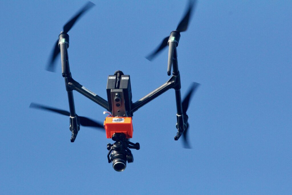
Already CODEX has developed several open-source hardware and software tools. We developed, produced, and published LidarBoX (Bierlich et al., 2023), which is a 3D printed enclosure for a LiDAR altimeter system that can be easily attached and swapped between commercially available drones (i.e., DJI Inspire, DJI Mavic, and DJI Phantom) (Figure 1). Having a LidarBoX installed helps researchers obtain altitude readings with greater accuracy, yielding morphological measurements with less uncertainty. Since we developed LidarBoX, we have received over 35 orders to build this unit for other labs in national and international universities.

Figure 1. A ‘LidarBoX’ attached to a DJI Inspire 2. The LidarBoX is a 3D printed enclosure containing a LiDAR altimeter to help obtain more accurate altitude readings.
Additionally, CODEX recently released MorphoMetriX version 2 (v2), an easy-to-use photogrammetry software that provides users with the flexibility to obtain custom morphological measurements of megafauna in imagery with no knowledge of any scripting language (Torres and Bierlich, 2020). CollatriX is a user-friendly software for collating multiple MorphoMetriX outputs into a single dataframe and linking important metadata to photogrammetric measurements, such as altitude measured with a LidarBoX (Bird and Bierlich, 2020). CollatriX also automatically calculates several body condition metrics based on measurements from MorphoMetriX v2. CollatriX v2 is currently in beta-testing and scheduled to be released late Spring 2024.

Figure 2. An example of a Pygmy blue whale imported into MorphoMetriX v2, open-source photogrammetry software.
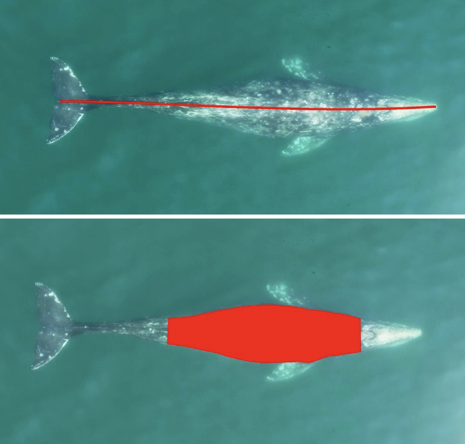
CODEX also recently developed two automated tools to help speed up the laborious manual processing of drone videos for obtaining morphological measurements (Bierlich & Karki et al., in revision). DeteX is a graphical user interface (GUI) that uses a deep learning model for automated detection of cetaceans in drone-based videos. Researchers can input their drone-based videos and DeteX will output frames containing whales at the surface. Users can then select which frames they want to use for measuring individual whales and then input these selected frames into XtraX, which is a GUI that uses a deep learning model to automatically extract body length and body condition measurements of cetaceans (Figure 4). We found automated measurements from XtraX to be similar (within 5%) of manual measurements. Importantly, using DeteX and XtraX takes about 10% of the time it would take to manually process the same videos, demonstrating how these tools greatly speed up obtaining key morphological data while maintaining accuracy, which is critical for effectively monitoring population health.

Figure 3. An example of an automated body length (top) and body condition (bottom) measurement of a gray whale using XtraX (Bierlich & Karki et al., in revision).
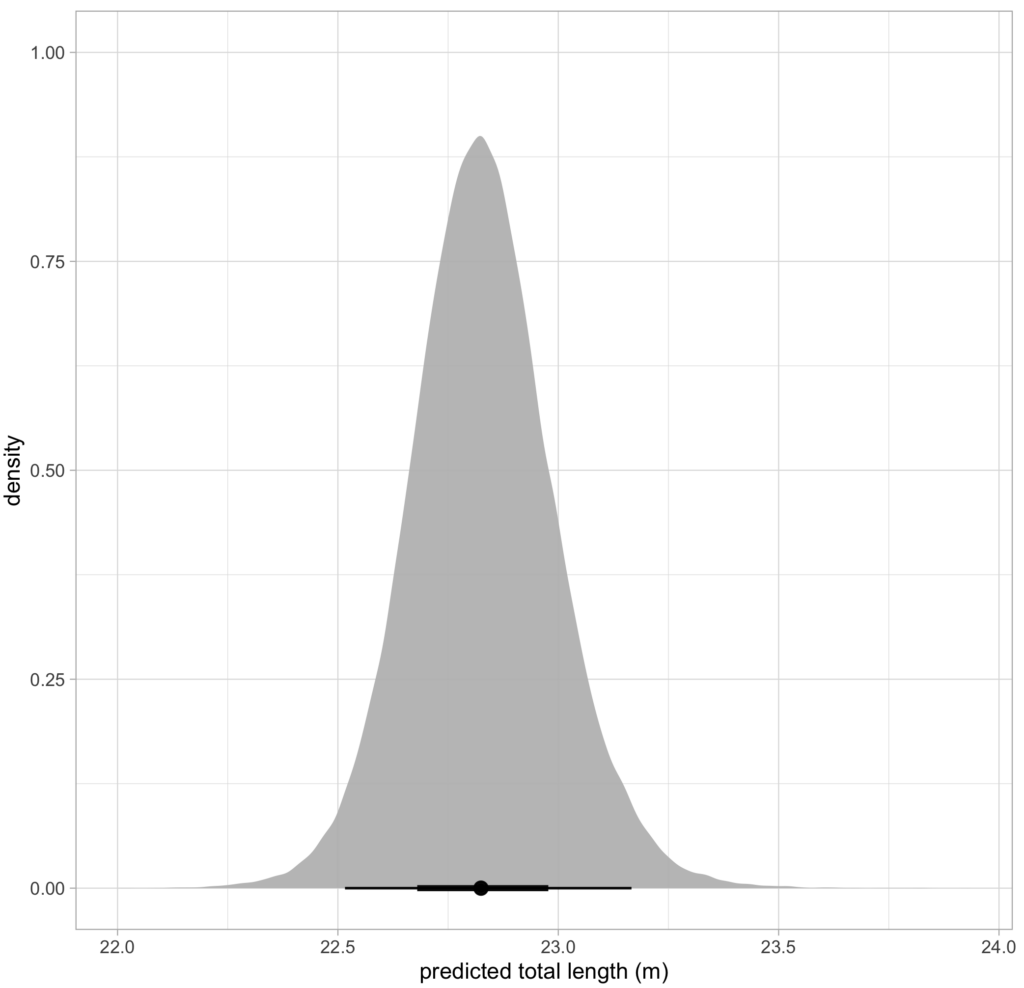
CODEX is also in the process of developing Xcertainty, an R package that uses a Bayesian statistical model to quantify and incorporate uncertainty associated with measurements from different drones (see this blog). Xcertainty is based on the Bayesian statistical model developed by Bierlich et al., (2021b; 2021a), which has been utilized by many studies with several different drones to compare body condition and body morphology across individuals and populations (Bierlich et al., 2022; Torres et al., 2022; Barlow et al., 2023). Rather than a single point-estimate of a length measurement for an individual, Xcertainty produces a distribution of length measurements for an individual so that the length of a whale can be described by the mean of this distribution, and its uncertainty as the the variance or an interval around the mean (Figure 4). These outputs ensure measurements are robust and comparable across different drones because they provide a measure of the uncertainty around each measurement. For instance, a measurement with more uncertainty will have a wider distribution. The uncertainty associated with each measurement can be incorporated into analyses, which is key when detecting important differences or changes in individuals or populations, such as changes in body condition (blog).

Figure 4. An example of a posterior predictive distribution for total length of an individual blue whale produced by the ‘Xcertainty’ R package. The black bars represent the uncertainty around the mean value (the black dot) – the longer black bars represent the 95% highest posterior density (HPD) interval, and the shorter black bars represent the 65% HPD interval.
CODEX has integrated all these lessons learned, open-source tools, and analytical approaches into a single framework of suggested best practices to help researchers enhance the quality, speed, and accuracy of obtaining important morphological measurements to manage vulnerable populations. These tools and frameworks are designed to be accommodating and accessible to researchers on various budgets and to facilitate cross-lab collaborations. CODEX plans to host workshops to educate and train researchers using drones on how to apply these tools within this framework within their own research practices. Potential future directions for CODEX include developing a system for using drones to drop suction-cup tags on whales and to collect thermal imagery of whales for health assessments. Stay up to date with all the CODEX ‘X’travaganza here: https://mmi.oregonstate.edu/centers-excellence/codex.
Huge shout out to Suzie Winquist for designing the artwork for CODEX!
References
Barlow, D.R., Bierlich, K.C., Oestreich, W.K., Chiang, G., Durban, J.W., Goldbogen, J.A., Johnston, D.W., Leslie, M.S., Moore, M.J., Ryan, J.P. and Torres, L.G., 2023. Shaped by Their Environment: Variation in Blue Whale Morphology across Three Productive Coastal Ecosystems. Integrative Organismal Biology, [online] 5(1). https://doi.org/10.1093/iob/obad039.
Bierlich, K., Karki, S., Bird, C.N., Fern, A. and Torres, L.G., n.d. Automated body length and condition measurements of whales from drone videos for rapid assessment of population health. Marine Mammal Science.
Bierlich, K.C., Hewitt, J., Bird, C.N., Schick, R.S., Friedlaender, A., Torres, L.G., Dale, J., Goldbogen, J., Read, A.J., Calambokidis, J. and Johnston, D.W., 2021a. Comparing Uncertainty Associated With 1-, 2-, and 3D Aerial Photogrammetry-Based Body Condition Measurements of Baleen Whales. Frontiers in Marine Science, 8. https://doi.org/10.3389/fmars.2021.749943.
Bierlich, K.C., Hewitt, J., Schick, R.S., Pallin, L., Dale, J., Friedlaender, A.S., Christiansen, F., Sprogis, K.R., Dawn, A.H., Bird, C.N., Larsen, G.D., Nichols, R., Shero, M.R., Goldbogen, J., Read, A.J. and Johnston, D.W., 2022. Seasonal gain in body condition of foraging humpback whales along the Western Antarctic Peninsula. Frontiers in Marine Science, 9(1036860), pp.1–16. https://doi.org/10.3389/fmars.2022.1036860.
Bierlich, K.C., Schick, R.S., Hewitt, J., Dale, J., Goldbogen, J.A., Friedlaender, A.S. and Johnston, D.W., 2021b. Bayesian approach for predicting photogrammetric uncertainty in morphometric measurements derived from drones. Marine Ecology Progress Series, 673, pp.193–210. https://doi.org/10.3354/meps13814.
Bird, C. and Bierlich, K.C., 2020. CollatriX: A GUI to collate MorphoMetriX outputs. Journal of Open Source Software, 5(51), pp.2323–2328. https://doi.org/10.21105/joss.02328.
Torres, L.G., Bird, C.N., Rodríguez-González, F., Christiansen, F., Bejder, L., Lemos, L., Urban R, J., Swartz, S., Willoughby, A., Hewitt, J. and Bierlich, K.C., 2022. Range-Wide Comparison of Gray Whale Body Condition Reveals Contrasting Sub-Population Health Characteristics and Vulnerability to Environmental Change. Frontiers in Marine Science, 9(April), pp.1–13. https://doi.org/10.3389/fmars.2022.867258.
Torres, W. and Bierlich, K.C., 2020. MorphoMetriX: a photogrammetric measurement GUI for morphometric analysis of megafauna. Journal of Open Source Software, 5(45), pp.1825–1826. https://doi.org/10.21105/joss.01825.


