An exciting technological innovation that applies to design is the use of design softwares like the adobe creative suite being brought to tablet and mobile interfaces; or applications like procreate being specifically designed for mobile use, offering no computer versions. This week we looked at the transition of media from physical to digital and how that impacted art and design, the role that the computer system played in the industry and the amount of creative liberty the individual had gained with this new technology. These expensive softwares also required machines and components that enabled above average performance from the computer to be able to efficiently use the programs and navigate the user interface. Today these softwares like photoshop, illustrator, procreate, and even 3D modeling softwares are being brought to mobile and tabled applications; opening up a whole new demographic of users and creators. Individuals who previously could not access creative softwares because of how difficult it was to obtain (a working version of the software and legally speaking.) Creative softwares are now much more widely accessible to a broader demographic of users; the increase in the number of individuals who create art and media to publish online or for personal use and not professional or commercial can contribute to a more culturally rich society. I can see the difficulty in bringing robust, high performance softwares like the adobe programs to mobile interfaces is difficult and requires a strong enough device to be able to operate efficiently but it can certainly be argued that the status-quo of design softwares are still not easily accessible and often require financial investment making progression difficult for students and emerging artists that might not be able to afford luxuries like a adobe subscription or a device that can even operate it. The constant innovation of technology and its applications will continue to shape the way we create and consume media. Creative softwares being optimized for mobile and tablet application is a positive change for the design industry by making the tools to create art and design more accessible to a wider demographic of users. Besides making the technology and programs less expensive, I am interested to see how creative tools can become even more accessible and how it will influence culture.
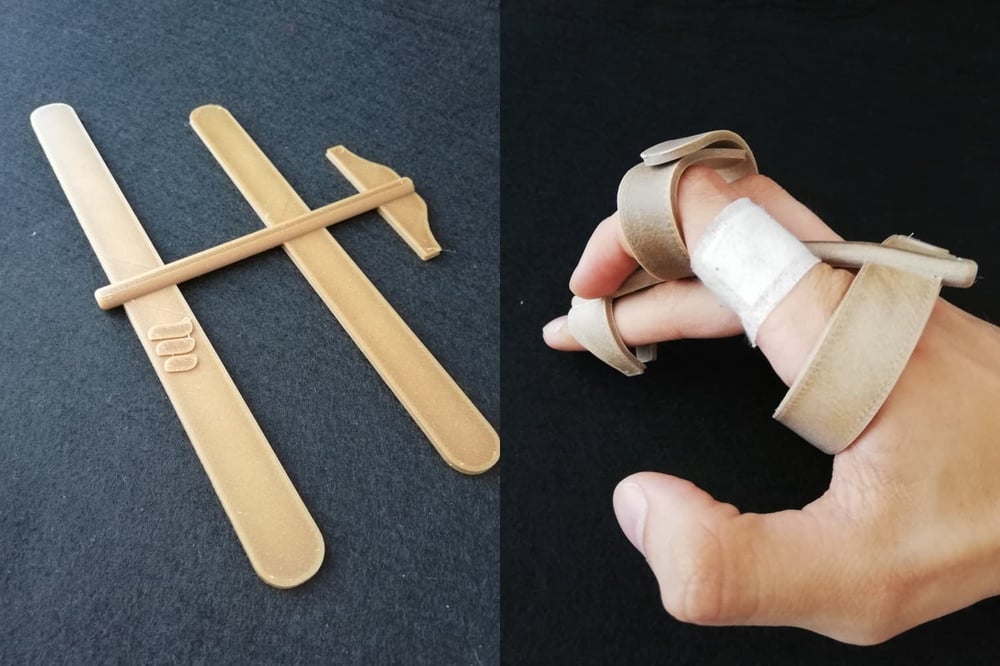
The object I chose is an example of product design for a disabled audience; using 3-d printing technology, this model assists the user in interacting with keyboards touchscreen and touchscreen technology. Created by a Mutual de Seguridad (Mutual Security) a non-profit corporation in Chile, this model is designed for individuals who have lost or limited control of their hands and fingers, a stylus is secured to the hand using molded straps. The 3-d printing technology currently used in the prototype allows the material to be heated slightly and molded to the user’s hand for comfortable use.
This model satisfies the users need to easily and comfortably interact with technology, however it does not attempt to solve the problem of touchscreen technology being difficult to use for disabled audiences. Interfaces that include haptics technology or recognize the use of gestures could be a more effective solution to make challenging interfaces more accessible to individuals effected by similar disabilities. This model is an excellent use of resources, it does not need to be mass produced or use any industrial processes, it can be printed at home using common plastic materials. Because this object cannot be directly bought from a retailer, it must be 3-D printed, making it difficult to obtain. Ownership and knowledge of 3-d printing technology is not common place yet, not everyone has access to this technology and even fewer when considering disabled audiences. However, because this object has an extremely simple design it is inexpensive and easy to produce, replicate, and modify. Because of this simple construction it is fairly inexpensive to hire a company or person to produce one.
The demographic that may be excluded from this device are disabled individuals lacking any way of interacting with technology, those individuals with missing extremities are not able to use the device. Because of its simple design, the object is easy to modify and repurpose, it can be easily modified to secure to another part of the body for use. Another way of making this product more inclusive is by incorporating a similar design into prosthetic limbs to increase the accessibility with prosthetics. The integration of prosthetics limbs opens up an entire different avenue of design and reaches a much broader demographic; developing prosthetics that can interact with constantly advancing technology. The level of accessibility prosthetic limbs could provide would go beyond basic mobility and restoring function. Basically the transition into self-engineered android humans, some might say evolution of humanity while others might say the end of humanity — only time will tell.
Europe’s Largest Green Wall “Will Absorb Eight Tons of Pollution Annually” in London
Lizzie Crook – reporter at Dezeen, graduated from University of Sheffield in 2016 with a degree in architecture before joining the magazine as a social media and editorial intern. She went on to work for former creative network YCN as a content editor and wrote for its members’ magazine and student-focused website; returning to Dezeen in 2018 as an editorial assistant. Studying a postgraduate diploma in interior design.
Designed by local studio Sheppard Roboson, the mixed-use Citicape House in London will have the “largest living wall in Europe” to help improve local air quality. The building will be wrapped by a facade of 400,000 plants that are hoped to “capture over eight tons of carbon [dioxide] and produce six tons of oxygen annually.” The vertical garden will be located on the UK capital’s Culture Mile, a heavy traffic area in the city of London, and will be replacing an existing office building to demonstrate one potential method of how the built or man-made environment can address issues such as pollution and climate change. Partners of the firm argued that an immersive and integrated approach would have the biggest impact on the local environmental conditions, creating a better and more livable city, as well as making a clear architectural statement. The Citicape House is planned to contain a five-star hotel alongside office spaces, event spaces, and various other social establishments. The construction is influenced by a pre-war building that had previously occupied the corner, however unlike the original building the ground floor will be receded from the street edge to allow a connection to a small plaza. The plants on the exterior will align with the trusses and structural support of the building to avoid “greenwashing the building” as described by members of Sheppard Roboson.
Crook, Lizzie. “Europe’s Largest Green Wall ‘Will Absorb Eight Tonnes of Pollution Annually’ in London.” Dezeen, 15 Nov. 2019, www.dezeen.com/2019/11/11/citicape-house-green-wall-architecture-sheppard-robson/.
Where Experiential Design Meets Sustainability by: Stephanie L’Estrange
Stephanie L’Estrange – Senior associate and director of design at TAYLOR design — strategy based design firm specializing in healthcare, education, science & technology, and assisted living. The firm has received several awards for sustainable design and committed to AIA challenge – all new projects and major renovations to be carbon-neutral by 2030.
This article analyzes the benefits of sustainable design in the healthcare industry, the aspiration to create a comfortable space filled with natural elements that contribute to the healing process. L’Estrange writes that in implementing experiential design, architects and interior designers cannot lose sight of the sustainable practice that should dictate the entire project process; she argues that the work of experiential design can serve as a catalyst for a heightened level of awareness and affirmation for the organization’s attention to responsibility. The materials selected should be warm, soothing, and communicate their sustainable attributes. Hospital branded bamboo patient blankets and plaques/posters that greet patients, visitors, and staff, informing them about the sustainable decisions and where the materials were sourced are two examples described by L’Estrange also writes that a healing space should offer choice and customization to better accommodate user needs; the example she gives is a turnable LED light fixture that can emulate natural light while automatically changing color to match the circadian rhythms of our sleep patterns. She also points out the growing importance of these features; the generations that will soon comprise the majority of users (patients, nurses/doctors, designers) and are far more concerned about sustainable practices and their carbon footprint.
What Designers Can Learn from Indigenous Communities Fighting Climate Change by: Anoushka Khandwala
Anoushka Khandwala – London graphic designer, illustrator and writer; recently graduated from Central Saint Martins with a BA in Graphic Design. Passionate about pursuing diversity in the creative industry through empowering minorities, as well as decolonising our way of thinking about design. AIGA featured writer.
The article highlights the role design plays in the encouragement of endless consumption and its destructive consequences; designers being uniquely complicit in a system that is constantly producing and consuming. If the actions that seek to mitigate the impacts of climate change continue to prioritize free-market values, they have the potential to harm not only the Earth but the millions of people who will be displaced by effects of the climate crisis.By decolonizing our understanding of climate action, Examines the disproportionate amount of public attention given to organizations who often don’t give credit to the Indigenous movements that have long been on the frontlines of these movements. This article is an interview of three “creative practitioners who use design as a tool to highlight the relationship of indigenous peoples and the land.” Julia Watson, author of Lo-TEK: Designed by Radical Indigenism, which examines traditional ecological knowledge from different communities around the globe and how that might be the next generation of thinking for sustainable design. Knee Benally of the Navajo nation, member of Indigenous Action, is an anti-colonial, anti-capitalist agitator and uses design to propagandize; while Demian DinéTazhi’, founder of Radical Indigenance Survivance and Empowerment (R.I.S.E.), uses their art to platform voices of Indigenous descent. Although playing different roles, these voices unify to demand change through a subversion of hetero-patriarchal colonial power structures, emphasizing design as a way in which to manifest these principles.
Khandwala, Anoushka. “What Designers Can Learn from Indigenous Communities Fighting Climate Change.” Eye on Design, 15 Dec. 2020, eyeondesign.aiga.org/what-designers-can-learn-from-indigenous-communities-fighting-climate-change/.
The Sustainable Challenges and Opportunities in Environmental Graphic Design by: Dr. Wu Duan
Dr. Wu Duan – an associate professor of environmental design at Tongji University–College of Design & Innovation in Shanghai, China. She is a leader and cofounder of Public Design LAB in Tongji and the leader of environmental graphic design studio in Tongji Tiandi Institute of Art & Design Innovation. Duan Wu has a PhD in Architecture from the College of Urban Planning and Architecture, Tongji University; Master of Visual Communication Design and a Bachelor of Industrial Design from College of Art & Design, Tongji University. In her ten-year career she has worked on a broad range of projects including public design, wayfinding and environmental graphics, branding, exhibition design, landscape and urban design.
This paper analyzes the opportunities and challenges of sustainable environmental graphic design through two projects in Shanghai, China. The first is a wayfinding program for the Shanghai South Railway Station, a study using environmental graphic design (EGD) to support and enhance sustainable behavior–in this case to promote the use of public transportation instead of private. After the station opened in 2007, average daily passenger traffic reached around 300,000 people; shortly after, station users began to complain about the legibility of signage and the clarity of the wayfinding system. Volunteers assigned throughout the station to help people navigate the complex received 100 to 200 inquiries a day. Research and design for a new signage system began in 2008 and was implemented In 2010. The case study and research conducted concludes that properly researched and designed wayfinding systems can encourage more sustainable behaviors among users and deliver significant environmental and economic benefits not only for transportation buildings but all public spaces. The second is a signage and EGD program for facilities at Tongji University, demonstrating the ability of EGD to encourage sustainable behaviors. In a city like Shanghai, in order to meet universal needs, there tends to be less Chinese characters, more symbols, and more english. The redesign of the signage system in Tongji University integrates modern Chinese characters and words; characters combined with symbols can overcome literacy, language, and cultural barriers to help local and international students make sense of the space and culture around them.
Duan, Wu, et.al. “The Sustainable Challenges and Opportunities in Environmental Graphic Design.” SEGD, 2 Oct. 2014, segd.org/sustainable-challenges-and-opportunities-environmental-graphic-design.
Implementing sustainable practices into my personal design process is something I continue to work on and struggle with. One thing I have done to personally lower my impact is host my portfolio website through a through a service that uses various renewable energy sources to power their server farm. The same server is also used to host a multitude of websites to lower the total amount of server space and power required to run them (though for an upgraded charge your site can be hosted on a private server). Load times and site performance can be negatively impacted because of the shared server, I can see how this could be significant to a company trying to showcase their product or service but for my personal use it works perfectly. Small personal decisions seem inconsequential when compared the environmental impact of the top global corporations but they can help support the companies making responsible ecological decisions and to inspire change on a local level. Designing for social good goes hand in hand with designing for environmental good to create sustainable practices. One example of designing for social good I find inspiring is the Utretch Manifesto published in 2015; it argues that designers have gained a new role and greater responsibility in contribution to the creation of ‘the good society’. “A society that ensures that everyone has access to the goods and services needed for a decent existence.” The manifesto points out that designers are well placed for expressing this utopian concept of ‘the good society’ in an appealing way and to help translate it into practice. From this perspective the Utretch manifesto articulates ten theses, which can serve as a frame of action for a design process rooted in collaboration with society. The ten principals of the Utretch Manifesto are: engage with society, design socially, act sustainably, connect ethics and aesthetics, aim for commitment, be critical, be transparent, be supportive and modest, be persistently radical, and take responsibility together. I find that personally all of these are represented best by design socially and act sustainably. Each design contributes to the social interactions between users, analyzing and understanding these interactions and the often invisible social structures that exist around them is a crucial task of designers for the shaping and creation of the social environment. Each individual faces choices that contribute to or take away from our ability to manage our natural resources in a sustainable way; designing socially contributes to a sustainable use of available resources and strengthening of society.
Design has always been utilized in politics to communicate a specific message to an audience; flags with identifying colors, shapes, and symbols are used to represent entire nations. Each nation creating a unique style of art representing their culture and history. Historical design movements are often seen as a reaction to the politics and culture at the time. Italian Futurism emerged around 1909 with the publishing of a manifesto by poet and propagandist F.T. Marinetti; Futurism served as a response to the autonomous state of art in society, the rejection of tradition, and the emphasis on innovation and technology. In “The Founding and Manifesto of Futurism” Marinetti declared Futurist art would act as an incendiary device, upholding the new values of speed, destruction, and violence necessary for a new age of Italian glory. The rise of Futurism was in direction connection with the rise of fascism; in 1929 Marinetti accepted the prestigious appointment from Mussolini to the Academia d’Italia. From the start Futurist values embodied a nationalist campaign of war and destruction that found representation in Italian fascism. The movement sought to violently annihilate the past and undertake an aesthetic revolution of politics and everyday life. Futurism’s goal to create a new social order through the intersection of art and politics was destined to fail from the start; conflict between the movement and the Fascist regime stems from discrepancies between the aesthetic and political principals of the Futurist project. Specifically Futurism’s aesthetic vision of politics that came to be disappointed by the regime’s inevitable turn toward autonomy and compromise. Art historical accounts today attempt to downplay the question of political influence in favor of the role of Futurist aesthetic innovations in the legacy of modernism. It seems that most commonly that the relationship between Futurism and fascism is ignored entirely through implicit assumptions about the separation of art and politics. In a major Futurist exhibition held at the Museum of Modern Art in 1961 Joshua Taylor writes that “the nature of the Futurist impulse in politics … should not influence the assessment of its achievement in art. “ Another way some forms of media attempt to downplay the political aspect of Futurism is relating it to a later, less aesthetically important phase of the movement. The intersection of design and politics can be used to create and advertise messages that inspire positive change; this power can also be used to send messages with divisive rhetoric to misinform and persuade audiences. Political influences in design can be seen throughout history and continue to play a significant role in design today.
1977 Londonderry, Vermont is where Jake Burton Carpenter spent his days making ‘Burton Boards’ in a barn and testing them in the backcountry of southern Vermont. Over 40 years later and Burton is an international corporation with factories and offices around the world. Burton has used their reputation in the industry and international presence to advocate for human and environmental rights by giving back to the community as well as making strides in sustainable production and the reduction of carbon dioxide emissions. Burton’s logo-mark has seen dozens of iterations throughout the company’s history with the famous mountain icon making its first appearance in 1979. The latest redesign done in-house goes back to the company’s roots with a modern, geometrically balanced look; emphasizing the role of the environment as a uniting cause.
The mountain icon used in Burton’s new logo comes from another iteration of the original from 1983. The previous version was unbalanced and the points lacked consistency in sharpness but more accurately reflected the rugged nature of the mountain. The left side of the icon extending lower than the right made it appear titled when used on products or placed as a sticker. The refreshed mountain was constructed on a grid to maintain balance and the points were made a consistent shape to make the icon appear more uniform. The return to the mountain icon signifies the re-focusing of brand values to align with current issues like climate change and human rights; the mountain being a central environment where those ideas come together. Similar to previous versions, the mountain is always to be accompanied by the word-mark; although it is now located underneath the icon instead of being incorporated into the shape. This allows for clear legibility and the elements to be more easily recognized independently. Going in a different direction than their 2000’s skate inspired graphics, large bold letter marks like B that looked like a 13 or the weird arrow thing they had when I was introduced to their brand. More geometric direction, balanced for easier application, matching better with lineal typeface and following the modernization minimalist trend. Bar logo and all caps word mark, bold and provocative while clean and organized, coming from 90s counterculture expression and snowboarding being an emerging sport and increasing in popularity with younger audiences because lame old skiers just don’t understand.
Constructed on the same grid system, the secondary logo separates the two elements of the primary logo and uses them in specific instances where vertical space is limited or certain stylistic contexts. The two elements are used together but placed separately, one usually contained within the corresponding shape in negative space. This allows for more clear use and identification of the word-mark and the use of the mountain icon as a compositional element.
A horizontal tertiary logo is used when both elements need to be represented but vertical space limits the use of the primary; placed side by side with the mountain icon first (reading left-to-right) is referred to as the horizontal logo and is used on things like product tags or web-page footers.
Burton may have returned to an 80’s inspired logo but they ditched the disco poster, bubbly serif typeface. In place of the retro style type is Helvetica Now.
“Our typeface is central to our brand expression, and essential for our brand to show up loud and clear. Adherence to our typographic standards is how we show up with a superior quality look and feel and avoid looking generic.”
Avoid looking generic? Burton has followed in the footsteps of countless companies over the years in transitioning from a hyper stylized font that stands out on a poster and early 2000’s webpage ad — to an organized, linear, and corporate identity; Helvetica is just about as generic as it gets. “Similar to our own identity, refinement of a timeless classic” is pushing for modernity and following the minimalism trend. Burton’s choice of a geometric font looks cohesive with the mountain icon and does a good overall job of representing the company as one that provides trustworthy products and has decades of experience in the industry. The modernization of Burton’s identity is no surprise as the company takes its role more seriously in the industry, as they become more and more involved advocating for human and environmental rights around the world.
The only official colors listed are black and white, colored use of the logo is found in clothing applications and some forms of media but most commonly be used as black and white to ensure clarity and consistency. Makes sense but seems pretty lazy, but also smart, an easy way to make use of a variety of colors in products and media while the brand maintains a clean and unified appearance.
Burton’s refreshed identity pays homage to its origin and represents the brands core values; after Jake, the founder of Burton, passed away in 2019 the company has worked to honor his legacy by continuing their efforts of inclusivity and environmentalism. Following corporate modernist trends seen throughout the decades, Burton’s redesign does a good job of representing the cultured history of the brand and sport while maintaining a cohesive identity that represents more than just quality products.
Note: A small glimpse into the evolution of Burton’s identity
Marshall McLuhan’s “Hot vs Cold media” theory is a very abstract way of thinking about how the medium impacts the message or how the content is being interpreted by the viewer. A breaking news story on the front page a national newspaper will be interpreted differently on snapchat or similar social media apps; the same information and content will be adjusted depending on what form of media it is being communicated through. Those forms of media also have a certain level of engagement with the viewer. McLuhan’s hot and cold theory is about how active the role of the viewer is in the consumption of media, he suggests that the consumption certain forms of media are more fragmentary and others are more trial in nature. McLuhan’s communication theory has remained relevant over time through constant innovations in technology and new ways of consuming information.
It is important to consider the medium when sending a message now more than ever, with endless social media platforms and the access to information anywhere in the world, if the form of media cannot properly communicate the content then the message becomes misinterpreted or fails to be delivered to the viewer. This brings up the idea that with how interconnected the world has become through the internet and cellular communication that we now live in a global village. I find this idea to be faulty; traditionally village is referred to as a social division consisting of families or communities linked by social, economic, or religious means with a common culture and dialect. Google even goes as far to say “typically having a recognized leader” which is impossible to say after the events that took place in Washington D.C. on the sixth of January this year. Even excluding a leadership figure or governing body and the thousands of languages currently used, the cultures of the world are far too diverse to be labeled as a global village.
Though we are far more aware of the events and cultures around the world, someone from Sweden would have a difficult time interpreting a message originating in China. Technological innovations have certainly helped to bridge the gap between cultures though the translation of languages and international forms of media, the idea of a global village relies too much on the fact that we can now easily send a message instantly through email to someone on the other side of the world and not the cultures that unites groups of people. The idea that really unites us as people is that we are all human.